12/31/2009
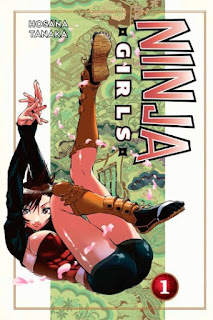
Ninja Girls vol. 1 and Samurai Harem: Asu no Yoichi! vol. 1
Koryū meets Harem Comedy
With all hubbub about how the manga bubble has apparently burst in Japan, I thought I would close the year by looking at two manga that combine two of Japan's more stereotypically retrograde aspects of Japanese fandom: A fantasy-fueled obsession with the country's classical military traditions (koryū bujutsu); and a more recent pandering to the fan notion that even the most pathetic males are truly special, and can even cause several formidable females to fight over him. We're a long way off from when Ittō Ogami walked the meifumadō during his quest for vengeance.
In Hosana Takana's story Ninja Girls, an orphan boy named Raizō wanders the battle scarred landscape of the Sengoku Period trying to eke out a living. This is made more difficult by the fact that he's shunned by everyone because he has a short horn growing out of his forehead. As it turns out, his disfigurement is actually a fortuitous sign. One by one, a trio of kunoichi find him and explain that his horn proves that he is the last surviving member of a once powerful feudal clan. Being faithful servants, they swear to protect Raizō and help him rebuild the clan. But more than that, they're all very attracted to his kind and gentle nature. The manga's requisite first girl Kagari is the shy and retiring type that no one expects to be a competent warrior. And indeed when they first meet, Raizō saves her from almost drowning in a shallow pool. She possess a kind of ninja superpower that dramatically increases her strength and resilience to physical injury. But Kagari has so little control over it that she claims it only works "when the man I want to kiss watches me". Obviously she means Raizō. That's what passes for female empowerment in shonen manga these days.
The setup owes a lot to the Tenchi Muyo franchise: The hero is a nonentity who discovers his aristocratic heritage while acquiring a squabbling unwanted harem. While there is a threat lurking in the background that pushes the plot forward, most of the volume centers on the domestic farce of the hero trying to broker peace between his servants/wannabe lovers. Despite the addition of one flamboyant cross-dresser, the characters designs aren't as oddball as Tenchi's. The humor just leans slightly more towards the sweet and sentimental than the wacky and violent.
In Samurai Harem: Asu no Yoichi! by Yū Minamoto, Yoichi Karasuma has spent all his life in the mountains with his father, training to be a bushi (a well worn cliche). But when his father realizes that his son has surpassed him, he sends him to train with the Ikaruga family, a related martial clan living in the big city. But Mr. and Mrs. Ikaruga are away indefinitely, and Yoichi must learn to cohabit with their four daughters. Unfortunately, he makes a pretty bad first impression at their first meeting. Despite their reservations, the eldest sibling Ibuki convinces her sisters to accept him out of a sense of obligation, if nothing else. Like his figurative ronin counterpart Keitaro Urashima, Yoichi the literal ronin has to figure out his place in the world by first trying to understand and appease his opposite-sex housemates. But the Love Hina comparisons don't extend far beyond that. Samurai Harem doesn't have any of its predecessor's wit or manic energy.
Looking at the two manga side by side, it's obvious which is far more gratuitous. The Ninja Girls female leads and their antagonists are dressed in anachronistic costumes which reveal way to much skin to be functional. But the fanservice quota doesn't extend far beyond this, which might disappointment certain fans. The manga is wallows in emotional the wish fulfillment of every nebbish who wants to be the center of attention of a bevy of pretty girls. To use the fans' own vernacular, there's more deredere than tsuntsun behavior.
However with Samurai Harem, there's a lot more tsuntsun directed against Yoichi by the Ikarugas; with the deredere emerging as they gradually learn to trust him. The manga pokes fun at his old-fashioned formal behavior, his manly code of chivalry, and dedication to an antique artform. He may not be a bumbling otaku, but the end result is that this yokel just as clueless and totally unprepared to deal with his new environment. Both manga use traditional domestic role playing as a comedic resource: At one point both male leads fall sick and the women fall over each other trying to nurse him back to health. Minamoto's visuals push the T&A element to much greater extremes: The Ikaruga siblings range from elementary to high school age; and Yoichi first meets each of either while they're barely clothed; or he somehow accidentally gropes them. Actually Minamoto often doesn't even bother to use him as an excuse to draw many between the leg shots. The female physiques possess unrealistic proportions; and their clothing clings to them in a manner similar to American superhero comics.
While the battles in Ninja Girls are mostly earnest affairs, the lack of any serious threats in Samurai Harem means that the fights have a more comedic shonen quality. Yoichi's would-be rival is a stereotypical school bully/delinquent whose fearsome reputation has the unfortunate side effect of scaring away the girls he likes. Their confrontations could be described as a misunderstanding between two equally clueless individuals who embody two different forms of machismo: straight-laced honor vs. teenage rebellion.
Both manga manage to conflate duty, subservience, sacrifice, bravery, filial piety, with romantic love. Love means devotion to your master - preferably one that's distantly related by blood or a tradition of past service. Add some butt-kicking, female infighting, cleavage or underwear shots, and all is good.
12/30/2009
Looking Forward to 2010: Short Pamphlet Reviews
Now that 2009 is winding down, I thought I'd mention a few stories that began serialization this year. Here's to their continuation in 2010.
Daytripper #1
After working for the superheoes of Casanova and The Umbrella Academy, the twin artists Fabio Moon and Gabriel Bá have come back down to earth with Daytripper, their new series for DC Vertigo. The lineart for this issue is beautiful. It's not often in mainstream comics that one gets to see such masterful brushwork. Moon and Bá eschew meticulously rendered and precise detail for a looser, impressionistic, approach that's more interested in conveying the panel's emotional resonance. And Dave Stewart's colors avoid the muddying effect found in many Vertigo titles.
By contrast the script for the story lays it on a bit thick. Brás de Oliva Domingos is an obituary writer living in San Paulo. He writes about the passing of some of his country's most famous figures, but has his own literary ambitions to become a recognized novelist. Unfortunately for him, he lives in the shadow of his father, a celebrated author. Brás' concerns of living up to the legacy of his father have contributed to his writer's block. And the situation is exacerbated when he learns that the elder Brás is being honored by a gala event. If the symbolism of the story setup isn't enough, the younger Brás remembers that the theater that will hold the event was known for a staging of Hamlet. Just to reinforce the Oedipal message, Brás wonders down a side street to buy a pack of cigarettes (He smokes the same brand as his father) and enters a bar named after the original owner, but now run by his son. What makes the script so stilted is that the characters' dialogue makes a point in spelling out what readers should have worked out through careful reading the story. Moon and Bá commit a few mistakes in belaboring the point.
Given the shock ending of this issue and the naturalistic setting of the story, I'm curious to see how the rest of the series will shape up. Despite its pitfalls, there is plenty of ambition and talent found here that makes this a series I'm looking forward to following in 2010.
Chimichanga #1
Eric Powell is another artist with an appealingly expressive style. The creator of The Goon has a new miniseries called Chimichanga, which displays his affinity with childlike humor. A traveling circus is populated by freaks who aren't exactly all that freakish. There's the fortune teller with a fairly normal looking goat; The not so strong strongman; There's an unlikeable boy faced fish and his gloomy faced clown companion. Finally there's a tiny but sassy bearded girl who's fond of chimichangas. She trades with a witch a piece of her hair for a large ostrich-like egg that hatches into a hulking, but harmless, beast whom she quickly names after her beloved Tex-Mex meal.
Powell draws cartoony figures that wouldn't look out of place being complimented by vivid colors. Instead he renders them in gradated monochrome. I'm not entirely convinced of this approach, but it doesn't detract from Powell's strengths as an artist. Every character looks like its been carefully designed, and everyone of them looks distinct, quirky and cute, but just creepy enough to make an impression on younger readers. The bearded face girl is a wonderfully realized amalgamation of the truly bizarre and the impish.
This is only a three issue series, but it's shaping up to be irreverent and goofy fun. And yes, it's entirely appropriate for kids.
Stumptown #1
Stumptown marks the return of Greg Rucka to writing female sleuths. He has an affinity with strong female leads that for the most part talk and behave no differently from their male counterparts. Although in this latest effort, the protagonist is a little less proficient than past creations. Artist Matt Southworth draws with rough lines calculated to evoke the gritty atmosphere appropriate for the milieu. But I'm not sure if the colors supplied by Lee Loughridge help as they tend to obscure some of the details in the linework. I get that Portland is supposed to be dark and gloomy. But does the city have to look so out of focus?
Dex is a detective forced to take up a job in lieu of paying her substantial debt with a casino. The casino owner's granddaughter has gone missing, and Dex soon discovers that several factions are working at cross purposes to find her. It's a familiar setup for noir fiction. But Rucka is in his element with this genre. All the plot elements are cleverly executed: The casino owner is an elderly matron who likes to knit. The mob boss is a conventional figure, but ably portrayed with a suitable evil soliloquy. Dex is written as a mostly external character: A down on her luck P.I. who tries, usually without success, to try to talk her way out of the holes she digs herself into. But despite her glib behavior, she manages to earn enough of a living to put a roof over herself and her younger brother who suffers from Downs Syndrome. Everyone who knows her starts a conversation by asking about him.
While Stumptown doesn't reinvent the detective mystery, it's a capably told start to an interesting page turner from a writer known for this kind of work. Dex is an interesting variation of the usual Rucka heroine: More working class professional than master sleuth, and more of a family member than loner figure.
12/26/2009
More NonSense: St. Stephen's Day Edition
Geek Toys
On his front page Thom Hogan compares Nikon unfavorably to Apple
Oh, Nikon, you try so hard, but you will fail if you keep pounding on the same wall. Yes, you've added things like being able to do a raw conversion in camera, and video editing, but let's face it, you're not a software developer, Nikon. Not even close. You can't even keep your regular software updated for operating system refreshes that are telegraphed more than a year in advance. Meanwhile, Apple has proven that there are tens of thousands of capable programmers out there ready to work 24/7 to cause a piece of hardware to fart (and much more that's actually useful). You see, the answer is not to try to do it yourself. Invert the Razor Blade, Nikon, invert the Razor Blade.He also has a best and worst of the decade list and revises his personal equipment choices yet again.
Speaking of Apple: while their all but confirmed tablet may not be the portable computer I've been waiting for, that doesn't mean I'm not interested in it.
Comics
Thorn would like manga translators to write better. Which is problematic, because most manga fans would like them to write worse. Or, to put it in less divisive terms, Thorn likes looser, more literate translations tooled to the rhythms and subtleties of English-language dialogue; fans prefer literal translations that deviate from the Japanese as little as possible. To a lot of fans, stiff translations are “authentic.” Nowadays, by the time a popular manga sees professional publication in the U.S., it already has fan translations online. Hardcore fans often attack the official translation as “unfaithful” if it deviates from the familiar fan version. Oh, the Light/Raito flamewars that broke out when Viz released its translation of Death Note…- Shaenon Garrity responds to Matt Thorn's contentious post on the poor quality translations of foreign language works.
12/25/2009
12/22/2009
12
Of all the high profile komiks that debuted at last October's Komikon, only 12 by Manix Abrera would be accepted as a citizen of alt nation. Virtually all of the other major works launched at the convention still cater to a mainstream audience by updating traditional popular genres. While 12 would not look out of place as a webcomic or an indie publication, everything about the book made a strong impression among the locals: From its unusually high price point for a Filipino book, to the fact that it was composed of 12 completely wordless stories. It also helps that Manix is the son of a veteran editorial cartoonist and the creator of his own newspaper strip. The book has since been the recipient of not a few superlatives.
12 could be characterized as a collected series of formal experiments in which Manix is expanding on conventional gag strip vocabulary. To facilitate this, he's eliminated text and reduced his figures to generic blobs, similar to those used by other indie cartoonists. Some of them feel like an extended gag strip: Two people coming to blows over who gets to ride an escalator in #3. The Schulz-like unrequited love in #2. Some subvert genre storytelling conventions, such as the frustrated serial killer in #5, or the lab accident origins of superheroes in #6. Then there are the characters experiencing spiritual epiphanies in #1, #8, and #11, which contain the most involved fantasy sequences. But the most entertaining are the tales of frustrated goals and desires found in #4, #7, #9, #10 and #12. Actually, in all the stories the characters are being thwarted in some way. Trapped in a perpetually mute state, most communicate through some form of violence. Sometimes this involves some form of self-immolation, usually found in the epiphany stories. But most of the time the violence is directed against an external element. In #10, a student taking an exam sends a tiny avatar to literally pick apart someone else's brain. But first it must do battle with the would-be victim's avatar.
This kind of humor that breaks down the barrier between social niceties and the cruelties of the real world may not be unprecedented to the comics medium, but it's still relatively new to the komiks scene. Because the lack of text and the homogenous visual approach, Manix leans a lot on his pacing and ability to illustrate universally recognized emotions in order to drive the story. He's certainly a brilliant artist. Some strips simply put the characters through absurd situations. While in others the reader is meant to sympathize with the characters in sometimes interesting ways. In #8, a lost girl sacrifices both her eyes to try to find her mother, with tragic results. And in #4 the POV switches midway from the person trying to kill a cockroach to that of the cockroach struggling to survive. There's a directness in the approach that's easily accessible to the average reader.
12 may, or may not, live up to the hype of being a postmodern masterpiece. But it's a bravura performance from a young but formidable talent. Because of its book format and bookstore distribution, it's in a unique position of introducing to an audience familiar with his past work a very different komiks experience. Of the new projects that came out of Komikon, 12 is the most important from the standpoint of the evolution of the komiks medium.
12/19/2009
More NonSense: Sneering at Everyone
Happy 239th, Ludwig van Beethoven
Guide to 101 Muppets
Just a reminder. I'm not above begging.
World
Chikan beware. You are now on camera.
Buddhism as a brand: Marketing the Shaolin Temple.
The New Identity Politics?
Comics
So yeah, Gary and the Journal bring a lot to the table. But they will both offer less — and possibly a lot less — if Gary spends all his time online preening over his past accomplishments and sneering at everyone who doesn’t have the good luck to be him. - Noah BerlatskyHere's some good online reading for the holidays. Enjoy.
The Hooded Utilitarian debates the merits of Dan Clowes' Ghost World. Postmodern masterpiece or pervy middle-age fantasy? Why can't it be both? Shaenon Garrity ways in.
12/17/2009
Fear of Forums
Ubunchu! by Hiroshi Seo
12/16/2009
Cover Design: Ambush Bug #6
Thanks to the Almost Darwyn Cooke's Blog for the info
12/15/2009
Funny Misshapen Body
Ever since his first self-published book came out, Jeffrey Brown has developed a reputation of being a chronicler of his own bittersweet experiences with romance and growing up. So what exactly does his latest autobiographical effort have to offer the reader? Unlike Clumsy and Unlikely, Funny Misshapen Body concentrates on Brown's overall artistic growth, with frequent digressions into his struggles with his poor self-image and Crohn's disease. If that sounds overly self-indulgent, Brown still finds ways to engage the reader.
Funny Misshapen Body is a collection of memories from Brown's life. But rather than arranging these events in more or less chronological order, they're often grouped around broad topics like Brown's perpetual shyness around the opposite sex, or the history of his developing tastes as a comic book reader. A few chapters tell formative experiences such as his hospital stay and surgery to treat his Crohn's disease, or a particularly harsh critique from the art school faculty which forces him to reevaluate his artistic ambitions. The latter event occurs much later in Brown's life, but is told very early in the book. This nonlinear narrative technique allows Brown to highlight and universalize certain emotions, such as Brown's own confusion and anger when dealing with the negative reactions of the faculty. But by withholding details that would help put the event in context, it also forces the reader to reconstruct much the larger story using material from later chapters. FMB is less straight autobiography than a series of excursions and detours spiraling back into one another.
The lack of a narrative with a conventional beginning, middle and end, avoids any heroic triumphalism. Events don't happen in any orderly fashion, but must be organized by the individual into a meaningful pattern. Brown isn't afraid to explore some of the more embarrassing parts of his live. But while FMB is no doubt self-centered, it isn't necessarily self-serving or self-pitying. The book is filled with a considerable amount of self-deprecating humor. And whatever heartache and sadness Brown experiences is always offset by his own good natured optimism.
As a memoir of his artistic development, this is in many ways Brown's most personal work. He often addresses the reader directly in the first person. "I don’t think our brains keep things in order, so I think I try to arrange stories to express the idea of figuring things out…” he explains of his nonlinear narrative. He's transparent about how poetry and creative writing contributed to his use of humor as a way of disarming his audience. And his comic book career and primitivist style came about only after he was willing to completely reverse his many years trying to become a fine artist. He knowingly gives the game away. But Brown is too unassuming to defend his choices. He only thinks they are the right ones for him, at least for now.
12/12/2009
More Nonsense
World
Rafe Bartholomew doesn't think that Manny Pacquiao should run for public office. The article is a strong indictment of the crooked nature of Filipino politics. But that's never stopped local celebrities before.
Michael Lind argues that the present international status quo will not change anytime soon.
Geek Toys
Nikon lenses graphical representation.
Fontcapture is a free web-based tool that will create a font from anyone's handwriting.
Thom Hogan and I want some of the same things. Speaking of which, I'm not above begging either.
Comics & Stuff
Shaenon Garrity writes about Power Girl's costume:
Again, I’m not criticizing the costumes. I’m criticizing these mealy-mouthed efforts to pretend the costumes aren’t what they are. Why do we try to force this stuff to fit our boring Earth logic? Porn movies don’t pause for a monologue about why the TV repairman forgot his pants.The Eastern Edge discusses the decline of manga in Japan.
12/10/2009
About This Earth One
If DC is trying to reach out to a much larger audience (And that's a big "if"), there's nothing in the announcement to indicate that this latest top-down effort is a radical departure from their usual brand name approach. The writers J. Michael Straczynski (Superman) and Geoff Johns (Batman) are familiar to the direct market audience. The cosmetic changes to the character designs don't exactly strike me as bold or different. Overall, Earth One comes across as just another expansion of their corporate work for hire traditions. Even the name of the imprint is a shout out to its own myopic history.
It's probably too much to ask that DC put far more serious effort into nurturing new personal styles and creator-owned ideas. Their last attempt to work outside their comfort zone was pretty halfhearted. But if they're sincere about wanting to attract new readers, shouldn't they at least reconsider the offbeat shojo Wonder Woman?
12/07/2009
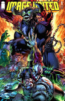
Image United #1
by Erik Larsen, Jim Valentino, Marc Silvestri, Matt Yackey, Mike Touris, Nikos Koutsis, Rob Liefeld, Robert Kirkman, Todd McFarlane, Tom Orzechowski, Whilce Portacio.
Party like it's 1992
While Image Comics survived the industry implosion of the early nineties*, the publisher's nascent attempt to establish a viable creator-owned superhero universe ended in mutual recriminations and the company's founders going their separate ways. Comic serials that once sold millions of copies are now seen as also-rans. The founders themselves have lost much of their former rock star status. Their once popular house style, first seen when they were working on various Marvel titles, are now the subject of ridicule by the very fans who faithfully followed them from Marvel to Image. At first there doesn't seem to be much demand to see them revive the old Image Universe. And yet Image United has reunited six of the founders and their respective characters to produce a company wide crossover that's less than two decades too late to capitalize on the company's initial success.** The one hold out is Jim Lee, who sold the creative control over his characters to DC. His contribution to this quixotic project is limited to an alternate cover. Joining them is writer Robert Kirkman, probably the publisher's highest profile creator since the time of the Image founders.
Before I continue, I'd like to share some personal background info. Image Comics was founded when I was returning to comics after a long absence. I was for a short time interested in the company's more violent take on superheroes before moving on to Will Eisner, alternative comics, eurocomics, and manga. I was already too old to be convinced of the originality of their ideas. But I wasn't completely immune to the speculator frenzy surrounding the company. I must admit, to my embarrassment, I read Wizard Magazine and to some degree bought into the hype over hot artists. I purchased several Image titles in the vague hope they would finance my retirement or something like that. Those comics are still around, unread since the mid nineties. As I mentioned before, Image seemed to be integral to the ubiquity of the local comic book retailers. But after the tsunami created by the first issues, came the long delays of subsequent issues. I saw the frustration among local fans, followed by apathy. Then the industry crash occurred. By 1995 the surviving comic stores were shifting their emphasis to selling manga. Local TV networks were already broadcasting their own dubbed versions of Dragonball and Sailor Moon before the Americans were aware of it. And the internet would further feed the burgeoning otaku subculture.
The Image house style was once seen as cutting edge partly because of its acknowledged manga influences. But with each passing year, it seemed less and less relevant. Its influence can still be spotted at Marvel and DC. But it appeals to a shrinking fan base while a newer mainstream is drowning in a sea of kawaii. ***
So what do the Image founders have to offer after all this time? I haven't been followed their careers all that closely, so the comic was an opportunity for me to see if they had changed or developed in any way. However they all seem to draw like it was still 1992. They're like aging band musicians who've reunited to play the old tunes in exactly the same way. So the art has all the stereotypical features that were once considered cool, but are now sometimes treated as weaknesses: The minimal backgrounds, the abundance of speed lines, the large and irregularly arranged panels, the splash pages that doubles as pin-up poster art, the distended bodies, the heavy cross hatching, the hyper masculine or feminine proportions, the armour-like costumes, the eternally flexed muscles, the facial grimaces, the overly-posed action sequences. And of course there's the coloring. Those original comics introduced many fans to digital coloring techniques that are now standard in the industry. But with hindsight those pages now look excessively bright, saturated, and metallic. It doesn't help that too many artists contributed to the making of this comic. Rob Liefeld lends some consistency by doing the layouts. But the small stylistic shifts between artists creates too much dissonance for this to be a successful collaboration.
There must be someone who was fourteen at the time and whose nostalgia is served by this crossover. But for former fans who now expresses contempt for early Image, this comic points an accusatory finger at them to say "Despite what you often claim, you used to love us. Don't deny it fanboy. We were crying all the way to the bank. So suck on this."
Robert Kirkman does a capable job of introducing this ensemble and having them split off into their respective mini adventures. The story is fairly easy to follow. But he seems to be slumming. The characters never establish their own distinct individual voices. The reader needs to be already emotionally invested in the Image Universe for this issue to have any emotional impact. Otherwise it's just a bunch of costumed jokers worrying about some undefined threat that no one cares about.
This is obviously a bad comic book. But it's a bad comic book produced by the biggest name creators from the early nineties. Certainly much of the criticism leveled against them is justified. But I often suspect that a lot of the backlash at the time was from fans who were not just embarrassed by their own tastes, but who were angry that so many of them considered venturing outside the acceptable confines of Marvel and DC. But before the Image house style officially existed, it was thought of as a darker and grittier version of the Marvel House style. Many of its features have since been absorbed by the next generation of mainstream artists. The Image style as an overall package may look laughable now. But for better or for worse, it was very much a next step in the evolution of the superhero genre.
___
*A set of circumstances the publisher has arguably contributed too
** Cue the late comics jokes
*** And a bookstore-based mainstream market
12/04/2009
Thor Giant-Size Finale #1
I happen to like Thor. There's something about mythologically inspired superheroes that appeals to me. Maybe it's the odd fusion of ancient characters with modern day settings. Maybe it's the brazen way in which the comic creators appropriate the beliefs of dead religions without fear of backlash. Or maybe it's all the unintentionally hilarious methods employed to make the character more authentic: There's the illogical mash-up of Roman, Hebrew, and Greek figures to invent Captain Marvel. The contemporaneous burlesque costume of Wonder Woman. Or the fact that Thor inappropriately uses the Shakesperian "zounds". I suppose those three make up my personal superhero trinity. So against my better judgment I've been following J. Michael Straczynski’s run since he revived the series. There were some amusing changes: Olivier Coipel's buff interpretation of the character. Loki is resurrected as a woman. Asgard is relocated to Oklahoma. But then Thor is banished and Loki convinces Balder to move Asgard to Latveria at Doctor Doom's invitation. So first the US government gives Norman Osborn control over their superhero program. And now Balder dumps his greatest warrior to hang out with two of the world's greatest sociopaths, one of whom is responsible for his murder.* Morons!
Despite the title, Giant Size Thor Finale is just marketing hyperbole. It marks the end of Straczynski’s stint as writer. Rather than concluding the story arc he began, he abruptly leaves it for the next creative team and company wide crossover to wrap up. I suspect that this wasn't his decision to end his run in this manner. But those are the pitfalls when working with a company owned character. The most disappointing part of this issue is the cynical manner in which two supporting characters are dispatched. Yet another reason not to become too emotionally invested in the Marvel Universe.
To justify the "giant size" title, the comic reprints Thor's original appearance in Journey into Mystery. I've got no issue with the decision even if it seems redundant. But I must object to the recoloring of the story. There is a need to digitally rework these older published pages to make them more compatible with advances in printing technology. That requires scanning them, cleaning them up, and creating digital separations for the black and white, and color elements. But just because the pages can be recolored with newer rendering methods doesn't mean that they should. I don't mean to impose my tastes, but I believe that pencillers and inkers of the time tailored their linework to suit the four color printing processes of the era. While the pages are early Jack Kirby Thor art, they're still representative of his use of thick lines, large black areas, and blocky figures. They're best complemented by the application of flat colors. Later digital practices simply weaken their impact. Please Marvel, when recoloring classic artwork, direct your colorists to show restraint with the use of gradients, cuts, color holds, glows, lens flares, and overlaid textures.
___
* I have no idea if this is still canon in Marvel continuity
12/02/2009
Socialist Hippie
Opening this holiday season by taking on religious nutjubs
11/27/2009
Beasts of Burden #1-2
Beasts of Burden is a deceptively cute comic. Or at least it would be had it not first appeared in Dark Horse horror anthologies. Written by Evan Dorkin and drawn by Jill Thompson, this gorgeously illustrated series blends the hoary practice of anthropomorphizing the secret lives of pets with the premise that the suburbs hide some truly horrible things. The original short stories - some of which have been made available online - were supernatural monster of the week adventures featuring a Scooby Gang of dogs and cats for protagonists. They earned enough critical acclaim for Dark Horse to flirt with the idea of an ongoing series. The first two issues of the planned four issue run pick up where the shorts left off, and mostly conform to the original episodic formula. But there is a hint of laying the foundations for future world building should the series continue past its limited run.
Most of BoB's appeal hinges on the art supplied by Thompson. The delicately painted washes imbue everything with a soft glow that is appropriate to children's literature. It lends a picturesque quality to the the town of Burden Hill and the surrounding forest environment that can still just about convey that primal sense of dread kids feel for the things that go bump in the night.
But the art suggests that the story is meant to be read by at least older kids: While Thompson is clearly capable of rendering characters in a far more mawkish style, she applies restraint to the anthropomorphizing of the cast so that they still mostly look and behave like normal animals. Thus the violence is also less cartoony and has real consequences. Dorkin and Thompson make a concession to the narrative convention of using the animal's breed as a shortcut to underlining or contradicting the individual's personality: The Pug is pugnacious, the Jack Russell Terrier is excitable, and the Doberman looks mean but is actually a big coward. If this was a movie made today, the animals would be enhanced or rendered entirely in creepy looking CGI, while voiced by highly paid actors (Like here). So I count it as a good thing that the reader has only the comic art as a reference for now.
Issue #1 is somewhat hindered by the need to reestablish the characters. While there is an attempt to minimize the info dump, the dialogue is sometimes hampered by the regular referencing of past events. The supernatural threat that eventually reveals itself is visually impressive, but seems to be mainly there to demonstrate the demon fighting credentials of the Scooby Gang.
In Issue #2, the gang has been shouldering more responsibility in protecting Burden Hill. But the series then veers unexpectedly into far more ambiguous territory when the threat turns out to be internal in origin and too mundane for their supernatural training to handle. And the ending is the most shocking so far delivered by the comic.
11/26/2009
Evolution: Live with It
Let the feces slinging begin
11/24/2009
Bad Movies: 2012
Never ascend Mount Everest without the proper climbing equipment |
11/21/2009
You See Hentai, You Say Porn
Magical Girl Pretty Sammy by AIC |
Human Rights and Catholic groups, EU representatives, and government agencies, have praised the signing of the Republic Act 9775, also known as the Anti-Child Pornography Act of 2009. Tarlac Rep. Monica Teodoro, one of the co-authors of the bill is quoted to have said:
The passage of this landmark bill is very timely since we are going to commemorate the 20th year of the United Nations Convention on the Rights of the Child on Nov. 20...The bill seems to have widespread support, or at least no particularly strong opposition, from the local press so far:
Now that we already have a stringent law against child pornography, we can efficiently prosecute perpetrators who produce, use and distribute child pornography,
This is one law that while long overdue, is still welcome. If properly enforced then it would be integral in cleaning up our country's reputation for being a place where pedophiles, local and foreign alike, can roam free, victimize children, and get away with almost anything. However, like most well meaning laws in this country, there is always the distinct possibility that it will die a natural death due to lack of interest by law enforcement officials and agencies. The legislative department has done its part. It is now up to the law enforcement agencies and the local governments to do their part and protect our children from the worst kind of predators in this planet.Or this editorial by Fr Shay Cullen:
There is no total and absolute right over anything or anybody in the world. If the freedom of action of some is harming and allowing the abuse of others, especially children, then action must be taken to protect the vulnerable and the victimized. One right must not be used to violate another right. Besides we all have a moral responsibility to protect children and bring violators to justice. Industry has a social responsibility to make their services child safe just like any other product. They must put children before profits.
Fans of anime and manga who have heard the news, have reacted rather negatively because the law's authors supposably targeted hentai. According to ANN the bill's authors described hentai as Japanese pornographic cartoon that depicts children in explicit sexual activity. The source the site seems to be referencing is here. Teodoro's views are paraphased:
She explained that the said images of real and indistinguishable children in films, digital images or computer images, whether made or produced electronically or mechanically; drawings, cartoons, sculptures or paintings depicting children in an explicit sexual activity are just some of the visual depictions considered as child pornography materials.
The news has rippled throughout the fan community and raised the usual knee-jerk denunciations over government censorship. Sankaku Complex notices a larger trend of crackdowns in other countries:
The theatre of moralism seems a popular political pastime of late. Loli bans have been proposed in Japan, and passed in the US, UK and Australia. Perhaps such histrionics prove a useful distraction from poor economic stewardship...
The proposed bill itself obviously didn't single-out hentai or anime or manga. An earlier version of the bill can be downloaded here (Link by Gerry Alanguilan). I don't know how close this document is to the final version that was passed, and I can't find a copy of the signed law at the moment. So take it as you will. But here's the portion that's most relevant to artists:
(b) "Pornographic or pornography" refers to objects or subjects of film, television shows, photography, illustrations, music, games, paintings, drawings, illustrations, advertisements, writings, literature or narratives, contained in any format, whether audio or visual, still or moving pictures, in all forms of film, print, electronic, outdoor or broadcast mass media, or whatever future technologies to be developed, which are calculated to excite, stimulate or arouse impure thoughts and prurient interest, regardless of the motive of the author thereof.
(c) "Mass media" refers to film, print, broadcast, electronic and outdoor media including, but not limited to, internet, newspapers, tabloids, magazines, newsletters, books, comic books, billboards, calendars, posters, optical discs, magnetic media, future technologies, and the like.
(d) "Materials" refers to all movies, films, television shows, photographs, music, games, paintings, drawings, illustrations, advertisements, writings, literature or narratives, whether produced in the Philippines or abroad.
(e) "Sex" refers to the area of human behavior concerning sexual activity, sexual desires and instinct, and their expressions.
(f) "Sexual act" refers to having sex or the act of satisfying one's sexual instinct.
I'm not a legal expert, but the writing in this version strikes me as a very very broad and inclusive view of criminal pornographic material. Too broad. And the phrase "impure thoughts" bears the marks of moralistic Catholic preaching at work. The bill was also a general anti-smut proposal, unlike the later version which gained traction for being anti-child pornography.
The excerpt quoted by the press coverage:
...any representation, whether visual, audio, or written combination thereof, by electronic, mechanical, digital, optical, magnetic or any other means, or a child engaged or involved in real or simulated explicit sexual activities
Does the child in question have to be real, or can the person be completely simulated like a cartoon drawing or CGI?
I managed to find a copy of the law online. This answers my questions of what constitutes a child. The law's coverage is still very very broad:
For the purpose of this Act, a child shall also refer to:
(1) a person regardless of age who is presented, depicted or believed to be a child as defined herein; and
(2) a computer-generated, digitally or manually crafted images or graphics of a person who is represented or who is made to appear to be a child as defined herein.
(b) “Child pornography” refers to any public or private representation, by whatever means, of a child engaged in real or simulated explicit sexual activities or any representation of the sexual parts of a child for primarily sexual purposes.
(c) “Child pornography materials” refers to the means and methods by which child pornography is carried out:
(1) As to form:
(i) Visual depiction – which includes not only images of real children but also digital image, computer image or computer-generated image that is indistinguishable from that of real children engaging in an explicit sexual activity. Visual depiction shall include:
(aa) undeveloped film and videotapes;
(bb) data and/or images stored on a computer disk or by electronic means capable of conversion into a visual image;
(cc) photograph, film, video, picture, digital image or picture, computer image or picture, whether made or produced by electronic, mechanical or other means;
(dd) drawings, cartoons, sculptures or paintings depicting children; or
(ee) other analogous visual depiction...
(emphasis mine)
Take time to read the entire document. It's not lengthy.
The law also imposes heavy penalties on the exhibition, sale, and distribution of this material. What's particularly draconian is how it leans heavily on digital media: from internet cafes to ISPs to the content hosts to eliminate all child pornography. To quote a small part of the law:
SEC. 6. Duties of an Internet Content Host. – An Internet content host shall:
(a) Not host any child pornography on its Internet address;
(b) Within seven (7) days, report the presence of child pornography, as well as the particulars of the person maintaining, hosting, distributing or in any manner contributing to such Internet address, to the proper authorities; and
(c) Preserve such evidence for purposes of investigation and prosecution by relevant authorities.
An Internet content host shall, upon the request of proper authorities, furnish the particulars of users who gained or attempted to gain access to an Internet address that contains child pornography materials.
And just how are they going to police this?
To be honest, I'm not surprised by the mainstream response in the Philippines. No one wants to make light of the issue of enacting protections for the rights of children from physical, emotional, and sexual abuse. Local politicians have a history of grandstanding when it comes to protecting the morals of its citizens, making it difficult to discern their motives. During the Martial Law years, President Ferdinand Marcos briefly attacked mecha anime for being a corrupting influence on children. Of course, that's a very different situation from minors being forced into child pornography, which this law is clearly intended to fight against. Still the law did IMHO err so strongly on the side of protecting children that it's frustrating that there wasn't more balanced critical analysis on how this could affect freedom of expression and its enforceability.
Subscribe to:
Posts (Atom)