12/31/2008

It's a Nikon D90!

RETURNING GUEST-STAR: VICTOR CAJIAO
Victor Cajiao

Nothing wrong with the camera. It's a fine model. But you'd better be using one of these babies before getting snooty about your landscape photography. While I was never great with the square format, one of my favorite cameras I owned was a Yashica Mat TLR. I would have still loved to been able to afford a Hasselblad.

12/21/2008

Short Pamphlet Reviews

A brief rundown of a few recently read pamphlets.

Phonogram: The Singles Club #1
Writer: Kieron Gillen
Artist: Jamie McKelvie, Laurenn McCubbin, Marc Ellerby, Matthew Wilson

I haven't read the original miniseries, which was based on the idea of the magic of pop music. The lead story Pull Shapes is a beautifully illustrated character piece about the somewhat immature Penny B, a woman who derives her magic from dancing to music. The backup stories aren't as compelling. She Who Bleeds for Your Entertainment is about the dual portrayal of women in music as both victims and empowering figures. Murder on the Dance Floor is a lighthearted piece about how the right kind of music can change the mood and diffuse a tense situation.

Glamourpuss #4

Dave Sim continues tracing photorealistic art by analyzing the development of Alex Raymond's extreme fine line inking technique using brushes - He christens it the nightingale style. After he rejects the conventional explanation of how Raymond achieved the effect, he claims to have found another way to successfully duplicate the results (The reader can judge Sim's copy of Rip Kirby panels throughout the issue), but won't reveal how. As with every previous issue, his obsessive shop talk is mixed with eye-catching fashion illustrations and fake ads. These drawings are some of the best so far in the series, so maybe he does know what he's talking about. Heh. His satire, as usual, is still hit or miss and contains more than a little condescension. This disconnect between the fashion material and art instruction is linked by Sim's formalist fetish for figure drawing.

Supergirl: Cosmic Adventures in the 8th Grade #1
Writer: Landry Walker
Artists: Eric Jones, Pat Brosseau, Joey Mason

Why does every children's comic book DC puts out feel like it was also designed for the fanboy? Three pages in and the series is already cracking jokes about Kara being a "secret weapon". This is basically a fish-out-of-water story aimed at older children, with the super-powered alien functioning as a stand-in for the middle school student. Kara's developing powers work as a metaphor for the awkwardness of early adolescence. This is the gawkiest visual interpretation of Supergirl being currently published. As if the folks at DC didn't find her modest attire androgynous enough, she's given a boyishly short haircut. All she needs now are braces. The brightly colored art is similar to the retro look used in many Cartoon Network original programming. This could be a successful book, assuming kids still visit comic book stores these days.

Secret Invasion #8
Writer: Brian Michael Bendis
Artist: Lenil Francis Yu, Mark Morales, Laura Martin, Chris Eliopoulos

The final issue to this chaotic miniseries continues the rather confusingly staged Central Park showdown between the Skrulls and Earth's defenders from the last issue. It's the Skrulls for Pete's sake, so it's no surprise who wins. But Tony Stark gets blamed for the invasion, and Norman Osborne is celebrated as a hero, proving once again that Marvel Earth's media is run by a bunch of hapless idiots. Oh, the issue leads into the Dark Reign event arc.

Secret Invasion: Dark Reign #1
Writer: Brian Michael Bendis
Artist: Alex Maleev, Dean White, Chris Eliopoulos

This one-shot sets up the next link in Marvel's chain of event crossovers. Having replaced Tony Stark as the guy in charge of the Initiative and the Avengers, Norman Osborne convenes a new secret cabal consisting of Emma Frost, Namor, Loki, Dr. Doom and the Hood, for who knows what end. No one, except maybe the Hood, seems wiling to work with Osborne. But then he concludes the meeting by revealing some shadowy enforcer, which seems to achieve the desired effect. For an issue full of talking heads, the dialogue has all the flavor of a corporate board discussing a hostile takeover rather than a villainous gathering plotting to rule the world. Where's the bombastic pronouncements from Doom and Namor? Or Emma Frost's dry wit? As for the visuals, the characters, except Doom, appear rather mundane. Namor in particular looks like an unshaven, smelly, fat slob. What's up with that?

Hellboy: The Wild Hunt #1
Writer: Mike Mignola
Artist: Duncan Fegredo, Dave Stewart

Mignola continues to add even more layers to his already texturally dense world. Hellboy finally learns that the fairie folk are preparing for war. He then accepts an invitation to hunt for giants in the English countryside. Most space is used for recapping past events, building tension amongst the supernatural races, and explaining the traditions of the mysterious Wild Hunt. But it does end in a clever cliffhanger. Expect to see some two-fisted action involving our hero next issue.

12/14/2008

Speak of the Devil

Speak of the Devil by Gilbert Hernandez.
For a series produced by Gilbert Hernandez, Speak of The Devil arrived in stores with little fanfare - around the same time of the publication of Chance in Hell. Both works are based on the conceit that they are comic book adaptations of films that a certain Palomar character played a role in. While this meta-fictional layer is not required to understand the story, it can affect the readers' perception of the work. While Chance in Hell mimics more high-minded arthouse cinema, Speak of the Devil is more of a sleazy, exploitative noir thriller. Certainly the stark black and white aesthetic, the plot-driven story, the terrible dialogue, the supporting beatnik characters, the suburban anomie, the widescreen panels used as establishing shots suggest a movie from the 60s or 70s, despite some anachronistic details. The sexual fetishism depicted would have been perceived as rather explicit several decades ago, contrasted with the far more graphic violence, accurately portrays the conflicting, hypocritical, contemporary double standards towards censoring sex and violence.

A neighborhood peeping tom wearing a leering devil mask takes particular interest in watching the sexual antics of businessman Walter and his younger second wife Linda Castillo. At first concerned enough to report to the police after catching him peeping through their window, Linda's exhibitionist side later gets the better of her. The peeping tom is however Walter's teenage daughter from his first marriage Valentina, a talented competitive gymnast. Her own sexually unresponsive boyfriend Paul soon develops an interest in the peeping tom. Their mutual sexual obsessions lead the three down a dark path of murder and more illicit behavior.

Speak of The Devil part 1
There's not a whole lot to be said about the story without revealing more of the plot other than to say that all of main characters come to a tragic end. There's even a kind of twist ending to suggest the evil perpetuated by them continues on. For all the successful reproduction of film noir conventions, this is still a comic book created by one of medium's greatest living practitioners. Hernandez paces the story well and reveals the twists effectively through six-part pamphlet serialization. Needless to say his visuals are brilliant. While the constraints of space and the b-movie narrative limit the complexity of this work, his rough, cartoony, but evocative style captures the repressive atmosphere of the period and the disturbing sexuality the characters delve into. The black costume Valentina dons to conceal her feminine features is a nice visual effect. The unblinking eyes of the Devil mask, mirrored in the eyes of later murder victims, is particularly disturbing.

Speal of The Devil part 4
While Speak of the Devil is fairly straightforward in serving-up its sex and violence, something a bit more emotionally ambiguous and lyrical emerges as the characters come closer to their inevitable doom. For all the perversity perpetuated by Valentina and her cohorts, this is still a story about young people caught-up in powerful emotions they don't quiet understand, and ultimately undone by them.

11/30/2008

Short Manga Reviews

Here's a number of reviews I've been meaning to write, but haven't had the time till now.

Parasyte Vol. 3 by Hitoshi Iwaaki.
Parasyte Vol. 3

The core of Hitoshi Iwaaki's engrossing body horror series is fairly simple, if not particularly original. Teenage protagonist Shinichi Izumi forms an alliance of convenience with an alien parasite who has replaced his right hand, in order to defend against other hostile parasites. However some parasites are interested in observing this alliance. In this volume Shinichi and his parasite Migi encounter Hideo Shimada, a parasite who enrolls at Shinichi's school. He expresses a desire to integrate into human society. Meanwhile the Japanese government has become aware of the alien attacks, but has little to go on until they can capture a specimen.

Iwaaki's art isn't particularly polished. His backgrounds are perfunctory, and his figures are a bit stiff. Most characters' facial expressions don't stretch beyond surprise, fear, and anger. Not that they were written with any particular depth in the first place. Ironically the parasites that have taken over a human host develop far more interesting personalities, and their motives drive the conflict of the story. There's something a little off about the symmetry in the faces that Iwaaki renders. Intentional or not, this weakness actually helps make the parasites and Shinichi look far more malevolent. But while humanity may not be Iwaaki's forte, the depictions of unleashed parasites going on a killing spree are where he truly excels. The bloody confrontation at the end of this volume is a real visual feast and not for the easily upset.

Pretty Face Vol. 6 by Yasuhiro Kano.
Pretty Face Vol. 6

The final volume of this series brings the story to a very sudden end. The premise (which I discussed in my vol. 1 review) exemplifies shonen manga's ability to both titillate and thoroughly creep out the target audience - the , while no more egregious than any other manga, involves gender-bending male hero Rando Masashi either staring at his unsuspecting female classmates, or the reader witnessing the androgynous Rando coming close to being exposed in front of said classmates.

The series has put Rando in most of the typical situations readers have to expect of the genre: The beach, gym class, hot springs, sports fests, sleepovers etc. Several supporting characters have been introduced, but dropped instead of being developed. Midway through the series, there was an attempt to get the whole 'find the missing sister Yuna' plot thread moving. But after running into a dead end, it reverted to the usual episodic format. This inability to follow-up on this plot thread may be the reason why Yasuhiro Kano ended Pretty Face. Instead Yuna Kurimi unexpectedly shows-up two-thirds into vol. 6, and the story rushes to its conclusion, leaving a few plot holes along the way, and not quiet resolving every issue.

Ultimately, whether readers will find Pretty Face endearing or disturbing depends on how far they can buy into the idea of a virginal teenage boy swearing undying devotion to a girl who barely knows him and thinks he's dead. Admittedly the sheer weirdness of the premise and the slickness of Yasuhiro Kano's art kept me from dropping it.

Rosario + Vampire Vol. 1 by Akihisa Ikeda.Rosario + Vampire Vol. 2 by Akihisa Ikeda.

Rosario + Vampire Vol. 1
Rosario + Vampire Vol. 2

This is a by-the-numbers male fantasy. Shonen nonentity Tsukune Aono, by some twist of fate, enrolls in a school for monsters. He only figures this out after attending his first homeroom class. Naturally desiring to preserve his life, he decides to withdraw. But Moka Akashiya, the popular girl he has a meet cute with, becomes predictably attached to him, and convinces him to stay. Moka is an extremely powerful vampire, but her true abilities are suppressed by a crucifix she wears on her neck (Every student is required to remain in human form when on campus). Tsukune discovers that under duress he is the only one who can remove the cross, which is a good thing as he's in constant danger of being torn apart by his unsuspecting classmates, and sometimes by the faculty. For her part the lonely Moka considers Tsukune her first true friend. But as they settle into their daily routines, a circle of rivals/friends develops into the usual web of possible romantic entanglements; The twist being that most of the cast are supernatural monsters.

Author Akihisa Ikeda isn't the best artist I've seen, but he's skilled enough to draw the attractive female-centric cast and the requisite up-skirt panty shots. The manga is literally a monster-of-the-week series. Tsukune and Moka get involved in a certain school activity, which puts them into conflict with an antagonist. Said antagonist turns into a monster, and Tsukune is forced to unleash Moka's vampiric powers. I should point out that Moka goes through a Jekyll and Hyde personal transformation when she morphs into a full vampire. She also doesn't actually bite any of her opponents, but beats them into submission with roundhouse kicks. The 'necking' she reserves for Tsukune.

While Rosario + Vampire is a competent manga, it doesn't particularly stand-out. At least not yet.

11/03/2008

La Muse

La Muse CoverLike most kids, super-heroes functioned as a basic form of wish fulfillment - an escapist fantasy about, to quote Stephen Grant describing Superman (but applicable to the genre in general), a "Strongman who orders the world by physically imposing his will on it, to the betterment of but not necessarily with the consent of lesser men, and will do with regardless of their authorization." The onset of adolescence complicates that juvenile concept with ill-informed idealism. Young people suddenly became aware of general suffering, and wonder why grown-ups were screwing-up the world. The genre has been operating on this mode since Marvel Comics writer Stan Lee started to appeal to college kids. However the restrictions placed on super-hero universes limit how much real world issues can be raised. La Muse, created by writer and artist , is the latest comic to attempt placing super-heroes in a more real world context. The story began online, and can still be read in this version. It's been slated to be released as a printed book later this year.

On a sliding scale between idealism and Alan Moore-style gritty realism, La Muse falls closer to fantasy. The story works the angle that super-heroes would function more as celebrities than as masked vigilantes in the real world (à la Paul Chadwick's Concrete). Susan La Muse is a left-wing political activist who has been captured on camera using her superpowers. Rather than trying to cover it up, she decides to use her sudden fame to further her causes. She enlists the help of her non-powered sister Libby, a Hollywood agent. Libby isn't pleased by all the undue attention her sister is getting, and worries about the consequences of Susan's agenda. This immediately comes in the form of enemies, both personal and political, who want to stop her permanently.

La Muse 229
While the problems that Susan confronts are facsimiles of contemporary real-world issues, Susan La Muse offers no realistic solutions to them. This is because her powers function on a magically literal wish-fulfillment level. Global warning? Gone. Third-world hunger? Suddenly there's enough food to feed the starving. Nuclear weapons proliferation? Deactivated with a wave of the hand. It's all ridiculously easy for Susan. When asked by Libby where her agenda leads to, she responds "Just long enough for me to, you know, end suffering."

Susan's mary sueisms start with her extraordinary powers. In addition she's clever, charismatic, media-savvy, socially well-connected, attractive, and the most sexually experimental individual on the planet. She has mind-blowing sex with just about anyone (and almost anything). Sex is presented as a solution to various problems. And like a quintessential liberated woman, she prefers to make love, not war, in order to convert her enemies into allies. Since Susan is a walking deus ex machina, this makes it difficult to sustain any tension, even as Susan's ever growing list of enemies congeal into a vast right-wing conspiracy, mounting ever increasingly deadly attacks against her and her friends. But events in the later part of the story do force her to modify her tactics.
La Muse 232 La Muse 233
The line art for La Muse is gorgeous and more down-to-earth than the house styles that presently dominate the Big Two, which I find a relief. Despite the webcomic format, the comic conforms to the layout of the conventional nine and six panel grids. I suspect that the work was originally intended for print. The coloring however clashes with the thick, textured strokes of the line art. It feels perfunctory - bright and saturated to help define the subjects, but doesn't help improve the mood or atmosphere. Given the speed in which the comic was regularly updated, I'm impressed with how much was done. But I would have preferred to see coloring that blended more effectively with the inking.

While La Muse doesn't break new ground for the genre, it feels refreshingly new if only because it doesn't try to ape the cliches found in forty year old shared universes. It's the story of someone given the opportunity to change the world - she's actually aloud to do it, and suffer the consequences. A super-hero comic with a beginning, a middle, and an end. Is that so difficult to do?

La Muse 244

10/27/2008

Film Nostalgia

My move from film-based to digital photography was not a pain-free one. Of course this would be true for any experienced photographer. Film and digital are different mediums. While they share some similarities, and in theory accomplish basically the same thing inside a camera body, their respective behaviors are different enough that the photographer has to learn a new set of rules for exposure and image processing. And then there's the need to become acquainted with digital technology itself, from PCs to RAW Image software. I'm no luddite, and I've been using PCs since forever. But trying to master digital photography forced me to learn more about how to use Adobe Photoshop than all the time spent dicking around with it in art school.

Nikon FM3A SLR After four years trying to figure this all out, I'm not convinced my digital photos are any better than my film-based photos. Part of the reason for this is that my transition to digital also marked a move into color photography. Up to that time, more than ninety percent of my photographs were taken with black and white film. I didn't have a lot of interest in shooting in color. But with the purchase of my first DSLR, I felt the time was right to dive into color photography. It was an opportunity to grow. I don't think I'm quite as accomplished with color as I am with black and white, and I've recently found myself missing the peculiar tonal qualities of Tri-X, HP5, and Neopan 1600.

None of this should be taken as sign to return to film, but as an indication of how much I still have to learn. I've recently updated all of my digital equipment, except for my computer, which makes working with 12 megapixel images something of a problem. Images shot since October on my photoblog are all on the new body. I'll be shooting digital for the foreseeable future.

What seems to have prompted my sudden desire to do a bit of film shooting were online discussions of a retro DSLR. I don't expect this to be manufactured anytime soon, but what I really want is a nice retro film body - one that doesn't require batteries to operate. I regret never purchasing the Nikon FM2 or FM3 when they were still being produced, and would love to acquire either one of these bodies as backup for occasional film shooting.

I have this sketchpad in my room which is still relatively brand new as I haven't touched it in over a year. Where did my motivation go?

That's enough personal digression for now.

10/21/2008

Laika

Laika by Nick Abadzis.
I was too young to have lived through the era of the , but I do remember as a kid reading about the dog Laika, the first living being launched into space and orbit the planet. I was horrified that she was sent on a one way trip, and imagined her body left to decay in orbit, until finally burning-up in reentry. This was the kind of incomprehensible act of cruelty I thought grown-ups were only capable of. At the time her death was attributed to asphyxiation, which sounded bad enough. Only more recently was it revealed that she died prematurely due to a malfunction of the ships onboard systems.

Laika's story is the perfect hook to get children to read more about history. It's also an incredibly obvious example of how animals are often sacrificial offerings to the greater glory of man. The man in this case is - leader of the Soviet Union's space program. The book opens with him just released from the Gulag in the dead of winter. With no food and shelter, he keeps motivating himself to stay alive by repeating "I am a man of destiny. I will not die." Korolev's subsequent success in building the USSR's space program confirm his personal self-belief. But these also generate unrealistic higher expectations, which inexorably lead to him developing the project that would top all others - launching the world's first living space explorer.

Laika by Nick Abadzis.
While the repressive nature of the Soviet Union is alluded to, author Nick Abadzis concentrates on the personal rather than the political or scientific. As the dogs in the program were strays, there's no way to know the details of Kudryavka's (Laika's original name) background. So Abadzis fashions a fictional story full of the usual cliches about abandoned puppies, abusive masters, and sadistic dog catchers. It's clearly there to evoke compassion for the protagonist. But once she falls into the ownership of the government's space program, the story markedly improves. Several new characters take center stage: , the person in charge of animal training, and his assistant Yelena Alexandrovna Dubrovsky. Both Oleg's personal dislike and resentment towards the overbearing Korolev, and Yelena's empathy towards her animal charges express doubt about the program's methods, and give voice to the otherwise mute test subjects. The stress caused by working on the project is further ramped up by the unspoken romantic tension between the two. In contrast Korolev, historically the most important figure, is comparatively less well developed.

Laika by Nick Abadzis.
Abadzis draws in a shorthand which, depending on readers tastes, is either somewhat incomplete and lacking, or refreshingly spontaneous. He has a tendency to cram as many panels as possible into the pages, especially during the talkative parts. This unfortunately can cramp his artwork, but when Abadzis opens-up the panels, the results can be extremely beautiful.

Laika is a work that wears its heart on its sleeve. It's not difficult to see where the author's sympathy lies. This could easily have wallowed in cheap sentimentality. But the historical realism of the setting, and the compelling characters of the second half of the story manage to keep the story grounded.

10/15/2008

There's Nothing New

World's Finest #302

Superman getting smacked complements Superman is a dick and Crying Superman - A long-standing pattern of super-heroic self-mockery. This could be seen as a variation of The Worf Effect.

10/01/2008

Farewell Minx

Minx Logo
While the closure of the Minx line doesn't come as any surprise (Given DC's dismal track record for developing alternate publishing imprints) it's still a great shame that the end came a mere 18 months since it's launch. Minx was created to establish a niche within the expanding market for younger female readers found in bookstores. Despite the somewhat reactionary overtones in editor Shelly Bond's statements, it made perfect sense for a prominent publisher to make an effort to pursue this very important demographic so as not to get left behind. It was a significant sign that DC was sincerely looking beyond their aging direct market audience of largely adult males.

Janes in LoveThere's been a lot of online commentary about why Minx failed. In the end, the Minx books, despite some favorable reviews, never gained much momentum, nor generated much enthusiasm with the intended audience. In hindsight DC didn't seem to have a firm enough grasp of the market, and didn't publish books that would draw in a large enough readership, to recoup their enormous marketing costs. Minx could arguably still prove to be a success if DC is willing to stick with the process of nurturing the imprint with a more modest budget while paying closer attention to the tastes of their readers. Publishing more talent with a proven track record for attracting female readers wouldn't hurt either. But they've chosen to pull the plug instead, thus ending the company's most high profile attempt to reach past the traditional comic book audience.

For more on the end of Minx, check out Tom Spurgeon and Christopher Butcher.

9/06/2008

Black Lagoon Vol 1

Black Lagoon Vol. 1 by Ren Hiroe.
This volume delivers on its promise to deliver nonstop explosive action. There's plenty of John Woo style gunfights, high speed chases, and massive explosions to distract the reader from the paper thin plot and shallow characterization. It's like any Hollywood blockbuster, but bereft of sound and motion. And it's a lot cheaper to produce than film.

Japanese salaryman Rokuro Okajima gets kidnapped by a group of mercenaries piloting a modified PT boat called the Black Lagoon while transporting a disc containing sensitive information for his employers across the South Pacific. But he joins his kidnappers after learning that his company has left him for dead in order to retrieve the disc. He proves invaluable in getting the Lagoon crew out of a very tight spot, and receives the affectionate moniker "Rock."

The rest of the Black Lagoon crew is composed of the burly African American captain Dutch, the boat's mechanic and former university student from Florida named Benny, and the book's cover girl Revy - A sadistic Chinese American killer who functions as the crew's muscle as well as the reader's primary eye candy by sporting a form fitting tank top and cutoff jean shorts in all the fight scenes. As the team's resident hothead and most vocal cynic, she serves as a foil to Rock's basically decent behavior and level headed approach to any situation. Many non-action scenes involve Rock and Revy sparring verbally over ethical conundrums that arise during the Lagoon Company missions.

With the series having been set up, most of the rest of the volume concentrates on the Lagoon crew transporting the scion of a wealthy South American family while being pursued by Roberta - a seemingly unstoppable ex- guerilla dressed as a bespectacled maid while carrying an umbrella machine gun and a suitcase full of weapons. It's a wacky concept that liberally borrows from El Mariachi and The Terminator, mixed with . It shouldn't come as any surprise who she gratuitously dukes it out with at the end of the book.

Despite the potential for outrageous action found in these ideas, The action scenes are not particularly well executed. Ren Hiroe draws dynamic enough figures, but he obscures them with way too many awkwardly framed shots and flashy speed lines. The scenes are cut to make it difficult to follow the panel to panel continuity or to locate the characters relative location to one other. The backgrounds, when he bothers to draw them, tend to be pretty generic, which is unfortunate since the exotic setting should be part of the appeal of this series. After all the Lagoon crew gets to zip around South East Asia and interact with an ethnically diverse local population. It would be nice if Hiroe showed a little more interest in capturing the local milieu.

8/23/2008

Honey and Clover Vol 1-2

Honey and Clover volume 1 by Chica Umino.
I've been meaning to post this for some time. But you know, life gets in the way.

Honey and Clover sticks out amongst the various shojo manga translated into English. Creator Chica Umino draws in a scratchy pen and ink style, restrained in use of screentones and other effects, with minimal backgrounds. It almost like reading a sequentially arranged sketchbook. Most pages deviate wildly from the 4 panel or 6 panel grid - Umino can't seem to draw a normal square panel, as most are either tilted, warped, overlapping, or sent bleeding of the page. Sometimes they can seem overcrowded with many little word balloons and captions. This can look like it might be rather confusing, but fortunately the story isn't particularly difficult to follow. The characters themselves are appealingly cartoony and have an appearance of almost childlike innocence. The whole manga feels like it's set in a dreamlike world, seen through the eyes of an adult looking back on his naive youth. If there's any weakness to Umino's character design, it's that at times they appear to be a little too flat and simplified to stand out from the background.

Set in a Tokyo art school, the reader is introduced to the cast through the point of view character Yūta Takemoto, a second year student. The comic's episodic structure focuses on Yūta's peer group, and the one professor who manages to get dragged along to their various excursions. The comedy is derived from how they deal with the typical worries over money (They're impoverished college kids after all), getting enough protein to eat, partying, getting drunk, dealing with the holiday blues, working on assignments, passing courses, graduating, getting a job after graduation, and falling in love. It's all mundane slice-of-life material. But while the early humor never disappears, the tone of the story becomes increasingly bittersweet as the focus gradually turns more to the love lives of the cast. By the end of the 2nd volume, the two main love triangles are established, which presumably will dominate the proceedings of the rest of the series.

Both love triangles feature insecure males being drawn to emotionally traumatized females. On the one hand we have nice guy Yūta and talented Shinobu Morita falling for figure Hagu Hanamoto. Some readers are no doubt going to find their attraction to Hagu somewhat disturbing, as this 18 year old looks like someone ten years younger. She even behaves in an infantile way, playing with dolls, talking in simple phrases, walking around with a constantly distracted expression. But this combination of youthful appearance and prodigious talent has isolated her from the rest of her peers, which isn't helped by the overprotectiveness of her guardian, professor Shūji Hanamoto. While Yūta lacks the self-confidence to express his love directly, Shinobu expresses his by simultaneously bullying her into modeling for him while trying to outdo her as an artistic rival.

Honey and Clover volume 2 by Chica Umino.
The 2nd, more "adult", love triangle has senior student Takumi Mayama chasing after older woman Rika Harada while being pursued by Ayumi "Ironman" Yamada. Rika is a widow badly scarred by an accident which also took her husband's life. While Rika is quiet and emotionally withdrawn, Ayumi is outgoing and energetic. She's pretty and intelligent. She's a star pupil with her own instant fan club. Takumi ignores her for Rika, whom he works for part time at her design firm. But this doesn't stop her from confessing her love. Rika, on the other hand, has exhibited little interest in getting involved with anyone since her husband's death.

There are some other threads like Yūta's uneasy relationship with his stepfather, or Shinobu's unexplained absences. It's clear that he's involved in a scheme that's unrelated to the rest of the cast. But the interactions of the students are the central concern of the story. For all the youthfulness of that cast, the overall mood is one of nostalgic longing. Towards the end of vol. 2 Hagu goes out looking for a four-leaf clover. She is joined by Yūta, and eventually the rest of the gang. After an afternoon of fruitless searching, they settle down for a meal with professor Hanamoto. As they eat Yūta looks at the faces of his friends and thinks "I know the day will come...when all of this is past, and it all becomes a memory. But I know I'll remember it, over and over...That blue sky and the smell of the wind and the endless carpet of clover."

Ah, was I ever that ruminative?

8/03/2008

Some Thoughts on The Dark Knight

Heath Ledger as The Joker.
Heath Ledger as The Joker
So I finally got around to seeing The Dark Knight yesterday, perhaps this summer's (Or where I am now, winter's) most anticipated movie, partly because of Heath Ledger's performance as the Joker. And it's a justifiably praised performance. Overall the cast is generally so strong I didn't mind the weaknesses in the plot some reviewers have criticized the film for. Ledger's Joker is easily the most chilling onscreen adaption of the character I've ever seen. His hunched gait, shy expression, and slurred speech belie the evil this man is capable of - And then he jams a pencil up someone's f@&%. Aaron Eckhart's farmboy good looks complement his performance as do-gooder DA Harvey Dent. Maggie Gyllenhaal is an actual improvement over Katie Holmes as Rachel Dawes. Returning cast members Gary Oldman, Michael Caine, and Morgan Freeman are all good.

Anton Furst's highly stylized set designs for the Tim Burton Batman films have become so influential that it's something of a shock to see a real city skyline stand in for the fictional Gotham. The Spider-Man franchise was shot in the actual New York City, and that reflects the Marvel Comics approach of setting their characters in real cities. But DC's many fictional metropolises are fantasy fun-houses of adventure that mirror the personas of its super-hero residents. In The Dark Knight, Gotham is shot as a gritty decaying urban environment exuding gloomy elegance. Its muted realism eschews the gothic surrealism of most current comic book interpretations of the city.

Some reviewers, like Douglas Wolk writing for Salon, have criticized this version of Batman for not being brilliant enough. He's supposed to be fiendishly clever - The world's greatest detective and the most dangerous man in the world. Instead this Bruce Wayne/Batman (Played by Christian Bale) depends heavily on Lucius Fox to supply him with technological solutions to various problems, like James Bond does with Q. I find myself not particularly concerned about this issue. Batman's super-proficiency is a necessary compensating trait when working with the much more powerful teammates of the Justice League, and it's what keeps him a viable denizen of the DC Universe after more than sixty years. But I like my heroes (Like the relatively inexperienced character in Batman Year One) expressing some vulnerability. And this version of the DC franchise doesn't have to worry about taking down a rogue Superman, yet.

7/14/2008

Manga's Future

I’m not sure that manga readers here are really manga readers and I would even go so far as to say that they’re not even comics readers. There’s a love for the medium, but only within the shojo or shonen genre. They love the anime, and honestly, while I was watching the Le Chevalier D’eon anime, I couldn’t help but thinking “this is cartoons. It’s for kids.”
- Kai-Ming Cha

I am outright terrified that the North American manga publishing industry is going to turn into a mirror of the superhero publishing industry; comprised of adult fans clamouring for vaguely more mature versions of children’s material, operating in a two-company system, growing steadily more insular and inaccessible to the world at large. I don’t think it has to happen, of course, and I’d like to think I’ve discussed a few of the ways in which it won’t, but there’re my fears. Hopefully they’re never realized.
- Christopher Butcher

Naruto Vol. 1 by Masashi Kishimoto.
Kai-Ming Cha is stating the obvious here, although it's something that tended to get lost in the early heated pro-manga vs. anti-manga debate - Most consumers of any form of entertainment have narrowly defined tastes. Only a minority of readers are ever going to possess a broad and deep love for the medium. It's a lot easier for fans to identify themselves in relation to a certain camp, like superheroes, manga, fantasy, or science fiction. I'm reminded of all the hype about how the Harry Potter series got kids to read again, as if reading those books would eventually lead them to seek out Steinbeck and Shakepeare.

His second point is also equally obvious - People's tastes change over time. The young readers who enjoy or now are not necessarily going to like them when they become adults. This is one reason behind the arguments for a more diverse market: A wider selection of genres and styles attract a greater demographic range. However Kai overstates his case when he worries that the present generation of readers will outgrow manga, leaving only the next batch of incoming readers to take their place. How is the market's youthful bias different from other forms of entertainment? Most film and television is aimed at the lowest common denominator, so it doesn't surprise me that manga publishers market fantasies to a largely young audience. I don't see that changing in the foreseeable future. But one shouldn't underestimate the crossover appeal of some youth-targeted popular entertainment. So to me it's not at all a clear-cut case of manga readers only coming from a certain a juvenile age group.

Fruits Basket Vol. 5 by Natsuki Takaya.
Nevertheless the recent financial troubles of retail chain and publisher have shown that the previous period of spectacular uninterrupted growth has ended. The manga boom has gone on long enough that it can no longer be dismissed as a fad, but this also means that a generation has grown-up reading manga. This raises the question of what will happen to that audience. No doubt some will abandon the comics medium entirely. Some will continue to read manga or other comics on a casual basis, and others will become hardcore adult fans. If the manga market starts to hemorrhage readers and doesn't replenish them with sizable numbers of younger fans, then manga fandom will, as Christopher Butcher fears might happen, resemble the aging superhero fandom that made the direct market a dead end in the nineties before manga infused the western comics industry with a much needed dose of new readers. I'm inclined to believe that manga will continue to be mostly successful in attracting new readers, but Butcher is right in saying that publishers and retailers still need to get better at marketing to an adult audience. I'm inured to the crowds of gawky teenagers blocking my path when I wander the manga shelves of my local Borders, but they must deter a lot of would-be adult readers. There's still no real help for the uninitiated to differentiate between the different genres targeted to different audiences in the graphic novel sections of most bookstores. Further complicating the issue is that cultural differences can cause manga originally aimed at a younger Japanese audience to be repackaged as appropriate material for an adult readership, and vice-versa.

Looking at it from a wider perspective, manga is here to stay. Other countries have been exposed to manga and anime before the English-speaking world caught on, and even if the worst case scenario happens and Japanese comics market collapsed in America, it would continue to thrive elsewhere. Like it or not, manga is at the center of the comics world.

7/12/2008

Glamourpuss #1

Glamourpuss Page 17
"...I want to do photorealism pictures of pretty girls, so that's I'm going to do. The words were an aterthought. Okay, let's stick with that. " - Dave Sim

Glamourpuss #1 by Dave Sim.
Dave Sim isn't the first cartoonist who's wanted to spend time drawing pictures of attractive women, nor will he be the last. Not content with compiling his drawings into an art book, he's chosen to engage his audience in detailed discussion about his work. Hence we have a new series called Glamourpuss. This 1st issue contains Sim's attempts to draw his chosen subjects in the style of , , , and , accompanied by comics-style narrative text explaining the results of his efforts. The desire to document his autodidactic obession is combined with an almost equally strong need to instruct and inform the reader. He knows they'll only glance momentarily at each picture before moving on, so he insists they spend a bit more time marveling at the craft involved in order to draw like these old masters of the medium.

It's a curious project to say the least. Dave Sim is an accomplished comics artist - some would argue he's one of the industry's greatest living practitioners. So it's hard to ignore his retro choice of art style to impersonate from. The results are at first glance, very convincing. Sim uses as his reference various unnamed fashion magazine photos, which he draws in the photorealist manner. He also takes panels from the comic strip out of their original context, redraws them, then juxtaposes them along with his fashion illustrations. Needless to say, the continuity between the pictures is nowhere near as seamless as in a more conventionally constructed comic. But then again Sim seems less interested in telling a story for story's sake than in educating the reader about a bit of comics history. His self-crticism reaches maniacal levels as he attempts to guess what lines to leave in, how to depict certain textures with a brush, or what areas to interpret as pure black.

The centerpiece of the book is a six page sequence entitled The Self-education of N'atashae. It's composed of a series of full page drawings of one fashion model, linked by heavy-handed narration detailing her thoughts and misguided attempts to achieve spiritual enlightenment. Sim is attempting to simultaneously do several things: He's trying to demonstrate the immense difficulty of constructing a story from disparate sources; Provide a kind of secret origin story for the comic; And he's poking fun at the vacuousness of the fashion industry as well as the shallowness of materialistic western consumer culture. Sim just can't help being didactic.

Glamourpuss Page 13
Glamourpuss is basically a hybrid product - Part black and white comic pamphlet, part illusrated essay, and part fashion magazine parody. Digressions about craft are interrupted by spoof articles and fake ads. While the shop talk will be of interest to history buffs and aspiring artists, the attempts at humor produce mixed results. Dim looking fashion models make an easy target, but Sim's jokes are a heavy blunt weapon he ungainly wields to make his point. One article titled Skanko's Dating Guide might remind people of Sim's past controversial statements.

It's not clear where all of this is headed. While the fashion drawings are beautifully rendered, they also reveal the underlying homogeneity of the source material. There's something cumulatively oppressive about the overall tone of the work that probably arises from the disjointed panels and text's attempts to impress its lessons on the reader. Sim's parody gets a bit tiresome by the end of the issue, but he intends to continue Glamourpuss for more that 20 issues. What more does he have to say? Then again, Dave Sim is the man who delivered on his promise that would die, alone, unmourned and unloved after 300 issues. So I wouldn't be surprised if he has a master plan that will gradually reveal itself as the series unfolds.

Glamourpuss Page 9

6/29/2008

Larry Gonick Has a Blog

Raw Materials by Larry Gonick.

From Raw Materials by Larry Gonick for the Discovery Channel website. I enjoyed his past strips for Discover Magazine. I'd like to see those compiled.

6/22/2008

Poster Design: Explore. Just Protect Yourself

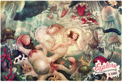
Two posters illustrated by DC cover artist James Jean for a European NGO. I doubt I'll ever see these plastered around Brisbane or Manila. Link by Mark Frauenfelder.

Print: AIDES: Boy
Print: AIDES: Girl

Update:

James Jean explains the creative process involved in the creation of these poster designs in his blog.

AIDES: Girl rejected poster art

6/19/2008

Curmudgeon

Harvey Pekar tells Rob Reiner off, but not to his face.
How not to negotiate with movie studios

In the stories published in the period before the production of the American Splendor movie, Harvey Pekar admitted that he was desperate to sell-out to Hollywood. His living expenses had increased now that he had a foster daughter to take care of. And he finally wanted to retire from his file clerk day job. It seems almost bizarre, but at the time he was even considering an option which would star former SNL cast member Rob Schneider. Pekar finds out that selling-out isn't so easy as it looks. He also started to wonder a lot about his creative legacy. He identified himself with overlooked artists and creators, and probably thought he was going to die in obscurity. The film was eventually made, and won a couple of awards. But it's funny how much worrying about it ever getting made took up so much of his time.