10/29/2009

Where Bold Stars Go To Die

We're All Grown Up Now

Where Bold Stars Go To DieOn the surface the Philippines retains a prudish attitude towards sex and public depictions of nudity. What this inevitably does is drive sexually-charged content behind its conservative facade. Since the 60s sexually oriented entertainment was labeled as "bomba" , and bomba komiks were sold on the sly. The Martial Law years initially saw a strict clampdown of the bomba genre, but this only led to a later resurgence of sexually oriented material now renamed "bold". But the bold movie genre continually faces pressure from the government body responsible for rating film and television, the Movie and Television Review and Classification Board (MTRCB), which oscillates between periods of prudery and leniency, depending on who's in charge of the agency and the presidential administration. They also have to deal with attacks from religious organizations who condemn them as immoral, particularly the powerful Catholic Church, and feminist groups criticizing the exploitative nature of many of these films.

Gerry Alanguilan is either sensing a possible backlash or simply covering his bases, because the afterward for his latest book Where Bold Stars Go To Die reads like a carefully considered preemptive defense:
"I think it's high time that people realize that comics has grown up in the last 20 years. People are making comics for adults now. Oh yeah, that's right. Comics are no longer just for kids, and to us in the comics industry, this is old news. This comic book is not for immature reading. That goes for children and adults with immature sensibilities.

The emotional and intellectual well being of children are the responsibility of the parents. It is their job to teach their children what they believe is wrong and what is right. That is not my job. My job is to write and draw stories, and to let myself go where that creativity takes me. That is my job as an artist. That is my reason for being. Do not pass that responsibility of raising your children to me, and to us artists as a whole..."
I personally think it's a bit embarrassing that this even has to be said at all.

WBSGTD is part comic, part pin-up gallery drawn by various Filipino comics artists. There is a mood throughout the entire book of arguing for a legitimate Filipino erotic comic art tradition, even drafting komiks legend Francisco V. Coching to make its case. But the 32 page story is a rather somber and all too earnest effort: A young man becomes fascinated with an 80s bold star who has since vanished into obscurity. It develops into such a powerful obsession that he somehow enters into some kind of collective unconscious where faded bold stars retain their youth and cavort in sun dappled forests. He then has an ecstatic encounter with a perfect vision of his idol. It feels like it's meant to be a beautiful, cathartic, even spiritual experience. But to me it just comes across as cliched as it sounds. If one of the goals is to show that it's OK for Filipinos to illustrate erotic subject matter, then the story succeeded. But there has to be much better ways of demonstrating that comics have grown up than telling this banal kind of juvenile wish fulfillment that ultimately cops out rather than deal with the emotional consequences of having sex with an actual person.

Even on the level of one callow youth's overblown crush on a media starlet, the story fails to connect because of the inability to observe the admonition "Show, don't tell." In the beginning, the protagonist's voice-over narration compares his object of desire to that of an angel. But the art isn't evocative enough to create the same impression. And when he finally meets her, she's physically indistinguishable from all the other pneumatically built bold stars inhabiting that spiritual plane. Even worse, she lacks any clear personality that could be accepted as remotely intriguing. There's nothing that differentiates her from the rest of the competition except the protagonist's declaration of her beauty.

Where Bold Stars Go To Die panels
The story art supplied by neophyte comics artist Arlanzandro C. Esmeña is of professional, if workmanlike, caliber. A lot of it looks photo referenced, particularly the likenesses of the bold stars. While this isn't as problematic for illustration work, it sometimes produces comics figures that appear flat, posed, and lifelessly static. Indeed the attention to accurate detail tends to inhibit the flow from panel to panel. The line work can be too tight and inorganic in places, particularly in continuously portraying natural-looking facial expressions. In contrast, the cover art he supplies has the grace and understated eroticism missing in the interior art. The pin-up art is mostly supplied by artists who draw in an American superhero vein. Two notable exceptions are Brice Beckham of Mr. Belvedere fame, and Arnold Arre who supplies pin-ups with cartoony, vaguely manga-style, lolicon figures. Not surprisingly the overall results are pretty, and emotionally removed from the subject.

Where Bold Stars Go To Die panels 2

10/25/2009

20th Century Boys Vol. 3

20th Century Boys Vol. 3 by Naoki Urasawa.
It's great that Naoki Urasawa is finally receiving increased attention through Viz's Signature Line. Urasawa is what can be recommended to fans when they realize that they've finally outgrown Naruto*, but can't quiet let go of the idea of a riveting good old-fashioned boy's adventure. 20th Century Boys, concurrently being released with Pluto, is just the kind of cerebral action thriller to appeal to the reader's changing tastes. I suppose that in Japan both manga serials serve as a fond revisit to the past for a certain generation that remembers consuming the works of Tezuka and his contemporaries, but I guess nostalgia for the popular culture of one's youth is a common condition in all post-industrial societies. And manga has been around long enough in the West that there should now be a generation of readers who will be more receptive to Urasawa's charms if they haven't given-up on the comics medium.

The first two volumes of the series were devoted to setting-up the story. Kenji Endō spent a typical childhood hanging out with his friends, building their secret hide-outs, reading comics, watching TV, exploring their neighborhood, and making-up stories about saving the world by fighting evil. But the now-adult Kenji begins to notice a vast conspiracy building around him. By the end of volume two, Kenji fully realizes that a nefarious cult is enacting the idle fantasies for world domination that he and his boyhood friends once dreamed-up to pass the time many years ago. And one of his childhood acquaintances may be the leader of this fanatical cult simply known as "Our Friend".

Volume 3 is the first turning-point of the series - the hero hearing what someone else referred to as the call to adventure. The person who forces Kenji to confront this uncomfortable truth is almost a supernatural presence: A homeless old man whose ability to foresee the future has earned him the name Kamisama (God):

Kamisama confronts Kenji 20th Century Boys
Kenji's initial reaction is to panic:

Kenji runs away 20th Century Boys
Followed by an all-night electric guitar session to steady his resolve:

Kenji rocks out 20th Century Boys
Kenji's actions are built on character development of the previous volumes. Virtually all of his friends that he still maintains contact with have grown-up and now live fairly normal lives. Kenji himself barely remembers his early childhood and has taken over the family business of running a liquor store, which he is in the process of turning into a convenience store. He also acts as a parent to his missing sister's baby daughter Kanna. In short he lives an average, unassuming life. But of all his circle of friends, he still retains the highest reserves of youthful idealism. At one point he became a rebellious rock guitarist. And while he's given-up on his dreams of a successful musical career, it's his love for rock music that he returns to when he makes his choice to answer the call.

"Our Friend", on the other hand, behaves like a twisted version of Kenji's idealism. For as yet unknown reasons he (or she) refuses to let go of those infantile good vs. evil fantasies. He instead chooses to turn them into literal reality. To Kenji's (and the reader's) complete incredulity, he has somehow managed to raise a secret army of totally faithful followers whose membership reaches into the Japanese government. His organization has apparently succeeded in building such futuristic devices such as laser guns and giant robots. The incongruity between the mundane and the fantastic defines much of the overall mood of the volume: When Kenji directly confronts the organization, his look of utter disbelief at their crazy schemes is akin to the reaction of a muggle who has just stumbled into the Ministry of Magic.

Kenji is confused at the Friends Concert 20th Century Boys
Urasawa has managed to fashion his pet themes of childhood, memory, and identity into a sly critique of pop culture nostalgia. He both acknowledges its corrosive power and its capacity to inspire while simultaneously managing to flatter his more mature audience: Kenji is a gawky middle-aged man who possesses as much common sense as anyone, and he becomes increasingly terrified as the story progresses. Nonetheless evil must be vanquished and the world must be saved. So he plays his guitar solo, makes awkward attempts to recruit potential allies, and then sets out into the darkness. Cue the music.

While originally serialized like most commercial manga, 20th Century Boys is constructed as a single complex narrative that constantly transitions back and forth between several time periods. And this is a dialogue-heavy story. But Urasawa's drawings always manage to illustrate a large and varied cast of characters, even managing to distinguish, yet portray as similar, the same character from different time periods. His pacing is compulsive enough that it doesn't get bogged down by the dialogue. In fact it makes for a very compelling page turner.

Our Friend 20th Century Boys
At the end of the volume, a mysterious Yojimbo-like character named Shogun is introduced. As of yet he has no connection to the events happening to Kenji, but as acknowledgment of the serialized nature of manga and as a promise of future story developments, the character makes a humorous meta reference in the very last panel.
___
*Naruto being a stand-in for any shonen adventure. I could have just as easily mentioned Bleach.

10/21/2009

Komikon 2009: Part 2

Bad Timing

Komikon was held at SM Megamall, which is far more centrally located and accessible than its usual site at UP Diliman. But it was also held at the same time as a mall-wide sale was taking place, filling the building to near capacity. While the shopping crowd mostly stayed away from the convention area, this made navigating the rest of the mall a nightmare. In addition, there were two other conventions taking place and using-up the rest of the available exhibition floor space.

One aspect of timing that could not be controlled was that the Komikon took place after the Manila area was hit by back to back typhoons. Gerry Alanguilan organized several Ebay auctions to help fellow artists and other typhoon victims. His efforts were extended to several live auctions at the Komikon. The pieces I did see sold anywhere from ₱1000-5000 (around $20-100).

Syeri Baet, Jonas Diego, Gerry Alanguilan, Komikon 2009.
Syeri Baet, Jonas Diego, Gerry Alanguilan auctioning off an ELMER slipcase

The Komikon was also held in conjunction with the first Philippine International Cartoons, Comics, and Animation (PICCA) Festival. More on the organizers of the event can be found in this article that's very much in the "go team comics" spirit. The only time the two events converged was the announcement of the winners of certain student cartooning contests. Apparently the next festival will be held in Quezon City. No word yet on the venue for the next Komikon.* The event was also the occasion for the launch of The First One Hundred Years of Philippine Komiks and Cartoons written by the academic John A. Lent. He made an appearance at Komikon. This is the only book I'm aware of that sold out at Komikon. The author, who edits the International Journal of Comic Art, was there for a short Q&A session.

Jonas Diego John Lent, Komikon 2009.
John A. Lent

Finally, the event put up a retrospective exhibition of the work of Francisco V. Coching and Alfredo P. Alcala at the far end of the hall. Most of the artwork displayed were reproductions obviously, but there were pages of what looked like original art, including samples of Voltar:

Francisco Coching, Alfredo Alcala Retrospective, Komikon 2009. Alfredo P. Alcala pages, Francisco Coching, Alfredo Alcala Retrospective, Komikon 2009. Alfredo P. Alcala's Voltar, Francisco Coching, Alfredo Alcala Retrospective, Komikon 2009. Alfredo P. Alcala Pages 2, Francisco Coching, Alfredo Alcala Retrospective, Komikon 2009.
They don't draw like that anymore.

___
*Update: the official site is conducting a poll on where and when to hold the next Komikon.

Update: The winners of the Komikon Awards have been posted. The biggest no-show at the event was best creator/best graphic novel winner Arnold Arre - creator of Martial Law Babies. The 2nd biggest overall winners were Mangaholix creators Groundbreakers Inc.

10/20/2009

Komikon 2009: Part 1

If the Metro Comic Con is the unholy spawn of Comic Con International, then Komikon, held last Sunday, is the closest the Filipino comic industry has to an SPX. Ever since the collapse of the larger comic book publishers, original Filipino comics have been for the most part synonymous with "indie" comics: the entire industry is still relatively small and tightly-knit enough that the notion of "team comics" could sometimes be felt rearing its head in both events. But within that small community is a wide variety of styles, philosophies, and approaches. For the first time Komikon was held inside SM Megamall, like the MCC a few months back. But because Komikon is more focused on the comics medium, it only took about half the space of MCC. The atmosphere was more low key. The crowds were lighter, and the entrance fee was lower. The occasional cosplayer could sometimes be spotted wandering around the booths, but they were such a forlorn presence, and mostly congregated at the entrance of the convention hall. So there weren't too many photo opportunities. This suited me just fine, as I made far more purchases than I did at MCC.

In this post I'll survey the komiks industry as mirrored by the event.

Big Fish in a Little Pond

There were a number of heavily promoted releases this year. The most high profile of these was the book launch of the restored and compiled version of colonial-era adventure by Filipino komiks legend . This restoration was a pet project of Gerry Alanguilan for the last five years, and is now being published by the educational organization Vibal Publishing. The story had to be restored from copies of the serialized pages as the original artwork was completely lost. I'm surprised that such a prestigious work is being published in softcover format. Come to think of it, all the books at the event were released as softcovers.

El Indio at Vibal, Komikon 2009.
El Indio Booth

The other big release touted by the event organizers was the horror anthology Underpass: Featuring stories written by Alanguilan, Filipino novelist David Hontiveros, and Trese creator Budjette Tan. The book is being published by magazine giant Summit Media, which is why the book is getting a lot more publicity than usual.

Gerry Alanguilan was also releasing two self-published books of his own: The collected edition of , and a new book Where Bold Stars Go To Die, which is Illustrated by Arlanzandro C. Esmeña. The latter book deals with the brief period of popular skin flicks that were being produced in the Philippines during the eighties. The good news is that ELMER will also be sold at National Bookstore.

Jun Lofamia and Danny Acuña, Komikon 2009.
Jun Lofamia and Danny Acuña

And if Gerry wasn't spread-out thinly enough, he also contributes some art to a much anticipated graphic novel MAJARLICA: Bayan ng Agimat by Rod Rodriguez, Vincent "Jann" Galino and Danny Acuña. The subject matter and art style are a homage to the kind of mythologically-themed komiks stories that were a widely-read staple in the fifties.

I'm probably leaving someone out, but the other major book releases that drew a lot of attention at the con were the third Trese compilation, and 12 by popular comic strip creator Manix Abrera. I gave the first two Trese books a very mixed review, and I will eventually post reviews of these two at some point. As I mentioned, my pile of purchases was bigger this time around.

Manga Rules

While Komikon's most hyped products were softcovers aimed at the bookstore market (Some of them partnered with established publishing houses), the traditional comic book still exists after a fashion. Mango Comics continues to release a number of comics-centered magazines, including the girl-oriented Mango Jam. They've also revived a few classic superhero properties. Gilbert Monsanto's self publishing effort Sacred Mountain Publications focuses on superhero pamphlets: Its most high-profile project is the creator-owned superhero universe title Bayan Knights. Alamat Comics also publishes a number of Western-style titles. But the slickest and most popular periodical is the anthology-style title Mangaholix Presents created by the studio Groundbreakers Inc.

Mangaholix booth, Komikon 2009.
Mangaholix booth

While there were a few titles that looked like Western-style alt comics, most of the creators selling minis were clearly influenced by manga. Most of them also have an audience developed through a web presence: Kickbackers, M3 Studios, Camille N, Makurai, daMEAT, Meganon Comics, Silent Sanctum,and lambchild are a random sampling of manga-style artists who have deviantART accounts. They possess differing levels of talent, but their stylistic choices means they all labor in the collective shadow of the world's largest comics industry. Their professional futures aren't all assured. And I get the impression that almost all of them are unfortunately limited to the conventional shonen/shojo axis. But their youth, artistic development through online communities, and their fluency with comic conventions absorbed from a different culture, distinguish them from the more established creators raised on printed matter at Komikon.

Loop by Camille N, Komikon 2009.
Loop by Camille N.

10/17/2009

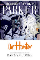
Richard Stark's Parker: The Hunter

Richard Stark's Parker: The Hunter by Darwyn Cooke.
I've never read any of Donald Westlake's novels, let alone his Parker series which he penned under the pseudonym Richard Stark. And even after reading this adaptation of The Hunter by Darwyn Cooke, I'm not about to start. So I'm in no position to judge the faithfulness of the adaptation. But this is still a comic book, and I have an opinion about whether Cooke's art is able to effectively tell its story.

First of, the story in itself sounds perfectly straightforward. After spending time in prison, master thief Parker tracks down the people who double-crossed him and left him for dead after the completion of a successful heist. Parker is neither a flawed anti-hero nor a sympathetic character (He was planning to carry-out his own double-cross). Actually he's not much of a character at all. But he's the perfect embodiment of the male revenge fantasy. While not sadistically cruel, he's ruthlessly efficient: Methodically applying bullying tactics and brute force to get his way. His only weakness is an emotional attachment to his wife, and that's eliminated early, which allows him to become a pure expression of male power. It's in line with much of the kind of adolescent indulgence comic books have been supplying for decades, and it works pretty well even though Parker's ability to get his way has the effect of deflating some of the dramatic tension towards the end of the story. Such are the pitfalls of writing a protagonist who reveals little of his inner life.

Parker's hard exterior is strongly conveyed by some incredibly terse dialogue, such as the one he has with his wife. I'm going to assume this is at least partially a carry-over from the source material:


Mr and Mrs Parker discuss the past
Mr and Mrs Parker discuss the divorce settlement

Such brutal and minimal dialogue can certainly do with some equally effective art. Cooke's art has always struck me as the kind that works as the occasional narrative illustration or pin-up. At the beginning, he puts on a virtuosic display in a wordless dozen-page sequence to establish Parker's entrance into New York City. It's beautifully drawn and nothing in the rest of the comic matches these pages:


Parker jumps a turnstile

But there's always been something a bit too clean about Cooke's animation-influenced character design. His women are all small-waisted mid-century dolls, such as this waitress from the opening sequence:


Pretty diner waitress flirts with Parker

It's not clear to me how much of that is due to Cooke's own predilections, the pre-feminist ethos of the novel, or a calculated move to appeal to the Direct Market. While his male characters, not surprisingly, posses more physical variety, even Parker, who's almost always cast with a menacing five-o-clock shadow is still drawn to look like a generic action hero:


Parker wants Stegman

One effect of Cooke's style is to mute much of the violence in the book. In part this is because he eschews more graphic portrayals and chooses to obscure these acts in silhouette or behind an object. But his drawings are just stylized enough to look almost bloodless. In the case of several explicit acts of physical abuse against women, not a mark is to be found to ruin their beauty despite being hit in the face. And Cooke avoids lingering too long on the victim after the act is committed.


Mal punches Pearl


An artist working with a limited palette is always a difficult challenge, and I certainly admire Cooke for making a valiant attempt. But the turquoise wash he applies is hit or miss. It can sometimes strengthen the composition. But other times, when the panels and figures become smaller, it can make it harder to decipher the action. This is because his washes are often applied with the same weight, and the results, especially when viewed from a distance as a two-page spread can look muddy. Interestingly enough the cover is given a more varied and vibrant color treatment, which leaves me wondering what the finished product would be like if this approach were used for the interior art as well.

Because of the monotony of the book's tonal scheme, a halftone pattern is used to differentiate the flashback sequences from the contemporary actions. I don't think this works as well as hoped, but only serves to make them slightly less legible. And this isn't helped by the decision to not give any of the panels a solid border. There's nothing wrong with the technique in itself. But when applied throughout the story and combined with Cooke's already broad strokes and flat color washes, it can exacerbate some of the muddying effect.

Below is an important sequence where Parker confronts his main betrayer. Cooke moves the camera point-of-view around like a film storyboard. It should be a powerful moment. But the differently sized panels bleed into another, making it much harder to follow the already confusing jumps between each character. Their actions look stiff. And the backgrounds so nonexistent as to make it difficult to ground them in a particular environment. It's a disappointing scene considering how much stronger the art was earlier in the book.


Parker catches Mal by surprise

I'm emotionally stunted enough to be enjoy the premise of the book, and followed it with interest to the end. I do think Darwyn Cooke is a solid artist. The Hunter is a good, entertaining read, but falls short of being a truly great work. It's beautiful in parts, but not all of it works as well.

10/13/2009

The Circle of Nerdishness III

Peepo Choo by Felipe Smith Volume 1Peepo Choo by Felipe Smith Volume 2

The David Welsh interview with Vertical marketing manager Ed Chavez about the publisher's expansion into more conventional manga is pretty interesting. He was quick to state that they wouldn't abandon the classic manga reprints that defined the company's image. The expansion was necessary to fund their classic manga titles, and for the long-term viability of the company.
Now this might come as a surprise to you, but our classic titles have not been bestsellers. While the titles have received great reviews and good publicity among certain communities they have yet to hit large segments of any specific market -- not the manga reader or the comic fan.

...I personally do not feel any publisher should limit themselves to a specific genre or image. That's what imprints are for. But a publisher should try to bring in as many readers as possible under their umbrella. Viz has done much more than Shogakukan seinen since they launched, Tokyopop branched out of Sailor Moon...
I don't have a problem with niche publishing. But if Vertical wants to be more like Viz...Actually the planned expansion is fairly conservative. Most of them are the kind of offbeat manga for older readers that's expected from Vertical. Chavez even managed to wrangle two disparate Kodansha titles: Chi's Sweet Home and Peepo Choo. I'm looking forward to reading both of them myself.

The underlying theme of the interview is the still developing tastes of the manga audience. Chavez admits that most of Vertical's titles do not appeal to the traditional fan who not only came to manga through anime, but continues to link the two as inseparable. What is needed is an audience with a broader and more "literate" understanding of the medium.
One thing about the top of the line seinen magazines is that they survive by catering to mature readers. The word seinen itself means adult and does not make reference to gender. So do not be surprised when you see something with crossover appeal in Kodansha's Morning, Shogakukan's Spirits, Futabasha's Action, or even Ohta Shuppan's Erotics F because in general adult manga readers are well read enough that they can handle a variety of stories as long as they are presented in a well thought out and properly laid down manner...

Seinen manga can be as dynamic as shonen or shoujo, but it's so well edited that it's crafted to be consumed and appreciated by the masses. I think this is why historically [Naoki] Urasawa, Kazuo Koike, Hiroaki Samura, Yoshihiro Tatsumi and even Tezuka and [Takehiko] Inoue have done well outside of manga circles in the US. That said those artists have all struggled to find readers from traditional manga/anime fans possibly because manga literacy, in regard to comprehension, is still in its infancy. Anime fans in particular want to see a specific design in their manga, and that's a shame because most of what they focus on is character design and not layout. In a way I wish Hikaru no Go had more fans because the layout [illustrator Takeshi] Obata puts down is seinen quality, possibly done on purpose since he was drawing something abstract like Go to a young audience and was working with a rookie author who was learning the ropes of thumbnailing.

Finding seinen titles that crossover is pretty easy. Selecting ones that will actually work that way here, because some fans are more resistant to change though, may pose a challenge. So we are going to be very careful with the marketing of these titles.
Manga fans resistant to change? No way!

10/12/2009

The Circle of Nerdishness II

Sheldon by Dave Kellett
Even creator-owned projects can be hijacked by their rabid fans

Sheldon by Dave Kellett.

10/11/2009

The Circle of Nerdishness

Justice Vol. 1 Justice Vol. 2 Justice Vol. 3
I was in the first grade when Barry Allen died. I don't understand why I should see him as the Greatest Flash Ever just because Geoff Johns says so. - Diana Kingston-Gabai
Yeah well, I wonder how many complained about Jay Garrick purists back in 1956? And if we're truly unlucky, future bloggers will have to contend with Bart Allen worship many decades from now. I'd rather not take the issue seriously, nor treat it in a literal in-universe fashion. Looking at the career of Alex Ross usually helps remind me of the unattractive qualities of nostalgia and fanboy obsession over minutiae. I'm from the same generation as Alex (And Geoff) and also grew-up on DC fare. But I didn't care for the increasing levels of adoration for an artificially constructed past found within each successive story. Nor did I identify with him when he began to proclaim ad nauseam of the greatness of DC's big three (Or big five). But I guess reverence goes with being a hardcore fan. Maybe that's why so many of Alex's projects get the deluxe treatment. And it's a sign of how much DC and Marvel are playing exclusively to that fan-base that they can treat their respective universes as the setting for some grandiose ongoing melodrama involving most of their characters and creating the illusion of change. Anyone who feels confused and alienated by this is going to have to find something else to occupy their time.

10/10/2009

I Wish I had Taken more Pictures

Baltimore's great. It has about 100 worthwhile museums ranging in interests from the traditional Walters Art Museum and all those students sitting on the floor sketching to the Geppi comics place I hope to visit someday. It has been a career background character in the films of John Waters, and was the backdrop of the greatest television show. It has Atomic Books, Pimlico, Jack's Bistro, Lexington Market and Edgar Allan Poe's grave. Walk around the downtown if you can; ever since Denver turned over I've felt Baltimore is America's best preserved city in a certain 1950s-1970s "George Sprott" sense. If you're not from one of the coasts seek out a place to devour some seafood. - Tom Spurgeon
Ahh...Tom's making me almost wistful. I realized awhile back that I had no good pictures of the Walter's Art Gallery. Just one roll probably from a disposable point-and-shoot taken sometime after I first arrived. So perhaps I'll go back some day (I like to take photo-centered trips). It didn't really hit me until I lived in the similarly sized Brisbane that between events like SPX and Otakon, Baltimore is a very decent nerd mecca. As for the local sights: If you've got time, you could also travel north from the Inner Harbor to my old stomping grounds like the City Cafe, the Baltimore Museum of Art, or an alma mater to see what those snotty art students are up to. Or take a small detour via water taxi to Fell's Point if you fancy yourself as the more bohemian type.

And since someone mentioned John Waters, I recommend watching Pecker. While it's not his best work, its subject matter is about my personal obsession, and features the work of an old friend of mine.

 Baltimore skyline
 Baltimore skyline
Speaking of well preserved, here's a Bolton Hill apartment view

10/06/2009

365 Days of Manga

Manga: The Complete Guide by Jason Thompson.
The one flaw of “Manga: The Complete Guide,” however, is that it is a book, and after it was published, the manga market kept going, producing more and more manga. Despite my pleas to publishers to stop all manga production so my book would forever be an icy memorial to a frozen world of manga, time marched on, and with every month incredible new manga — Honey and Clover! Black Jack! Moyashimon! — were being released. (And plenty of awful manga too, but that’s another story.)
- Jason Thompson


It's been almost three weeks since Jason Thompson started posting new entries to update the encyclopedic Manga: The Complete Guide on the Suvudu blog. The decision to update the book online rather than through a newly printed edition helps to highlight a few of the differences between contributing for print and web.

There were already several informative online resources for manga when MTCG was published, but that doesn't render a printed version necessarily redundant. A book cataloging every translated manga illustrates in a very tangible way their undeniably massive presence. Print also offers a number of advantages: The book provides a compact package and easy-to-use guide. The titles are cataloged alphabetically for easy search, and are supplemented by a glossary, bibliography, artist index, and introductory material - Pretty much everything needed to get the newcomer up to speed and enough material for the more experienced reader to use as a handy reference. You can get the same information online of course, but you have to be willing to navigate the sprawl of the web and you often have to have some idea of what you're looking for. I usually find myself reaching for my copy of MTCG rather than searching for it at ANN when I need to look-up an unfamiliar title. Your mileage may vary, but I think the book's more user-friendly to beginners and non-otaku. I suspect that most librarians researching for appropriate material for their collections would agree. It's also easier to skim through if the reader isn't searching for anything in particular.

MTCG is a bit too faithful to the film guide books it copies. For example I'm not a fan of the star ratings as there's always something arbitrary about assigning a score to works of art or entertainment. I also believe that a more comprehensive volume should have extensive creator entries in addition to the usual title descriptions. And there's always room to complain about what got left out. But I find myself turning to MTCG than other sources. This doesn't mean I unconditionally agree with the reviews found in the book. But since the book was authored by a relatively small group of people, MTCG embodies a uniform editorial standard and a consistent voice. I can engage with the opinions expressed in the book because I can grasp author's beliefs and biases. By contrast it's annoying to read a review that parrots the company's PR. And it's harder to engage with a wiki that averages the opinions of many contributors: I tend to give less weight to reviews that sound like they were written by committee.

One obvious limitation of every printed material is that they're all finite products: They're all created at a certain time and place. MTCG could never encompass every translated manga because it had to be printed at one point even as new titles were being released. And it becomes more dated with each new release. Publishers usually turn this into an advantage by printing new editions of their guides, so it's interesting that Random House chose not to pursue that option. According to Thompson, he had accumulated around 200 additional reviews, which he promised would increase to 365 when he began blogging the new material. Thus the working title of the new reviews - 365 Days of Manga.

When read as blog posts, the additional material looks kind of anemic. Thompson maintains the exact same format as with the printed versions. Each title contains a demographic assignation, content advisory, star rating, and short description/review. What has been posted so far runs the gamut from shonen fantasy to yaoi romance. The brevity of the posts mimic the entries of the book. But without the book's accessible structure as a supporting framework the blogging approach for each entry feels very scattershot. The posts end up getting buried in the Suvudu blog's collective archive. And it doesn't help that the site's own science fiction/fantasy focus is not really compatible with the wide range of genres found within the manga medium. This looseness is okay for most bloggers, but it doesn't reproduce the original's well-organized and searchable approach.

However every daily posting is accompanied by a manga giveaway, which implies at least a few reasons for this exercise - increasing site traffic and finding new Random House customers. So it probably makes sense to someone in marketing.

It would be ideal if MTCG and 365 Days of Manga were to be merged in the future, whether through a second printed edition, or constituted into its own web domain. I suppose it could happen; after the present online experiment has run its course.

10/04/2009

Resurrecting BeOS: Haiku

Haiku Desktop
Haiku is now available as alpha


Outside Link: Ars Technica

Short Pamphlet Reviews

Make mine Marvel...or not

Incredible Hulk #602: Hulk defeats the Juggernaut
Incredible Hulk #601-602 by Greg Pak, Fred Van Lente, Ariel Olivetti, Michael Ryan, Guru-eFX, Simon Bowland

Greg Pak returns to writing the Incredible Hulk, but only after Jeph Loeb has his way with him and leaves him a de-powered shell of his former self. The experienced fan should already know that's not going to last. Even the characters are genre-savvy enough to know this. In the meantime, Hulk's ingrate of a son is going to fill his big shoes. Skaar wants to kill his father, but settles for being trained by Bruce Banner until he can Hulk Out again. Just to prove that he's up to the task, Banner has him fight the Earth's biggest human punching bag, the Juggernaut. Once again, the fight demonstrates that the Juggernaut is literally an unstoppable moving object, but he's a bad guy so of course he's beatable when the plot demands it.

Bruce Banner uncharacteristically starts becoming more proactive. In one subplot he intervenes in a child abuse situation by creepily keeping tabs on the father, Big Brother style. How long is he going to keep that up? But what bugged me was this scene were Bruce picks up the Hulk's giant sword like it was nothing. What's this, anime? The digitally painted art is too stiff and the backgrounds too generic for my tastes. There's also a backup story about a She Hulk from one of Marvel's many alternate timelines that leaves me feeling indifferent.

Spider-Woman #1: Jessica Drew's origin
Spider-Woman #1 by Brian Michael Bendis, Alex Maleev, Cory Petit

The first from Marvel's motion comics initiative. The story is sandwiched between crossover events Secret Invasion and Dark Reign, making it a bit behind other serials, and a terrible jumping on point for a first issue. Jessica Drew sulks in her apartment, then gets recruited by secret organization S.W.O.R.D. to exterminate Skrull agents and other hostile aliens. I know it's standard operating procedure for Marvel characters to whine endlessly like teenagers in a high school drama, but when a 4th-string character tries to out-angst an A-lister like Wolverine, I stop taking the character seriously (That's not really true. The cover, complete with boob sock, immediately eroded my confidence in the title). Alex Maleev's photo referencing isn't too egregious and his style is appropriate to the morally ambiguous spy milieu. But he often sacrifices clarity for mood and atmosphere.

Thor Annual #1 by Peter Milligan, Tom Grindberg, Mico Suayan, Tom Grindberg, Edgar Delgado, Chris Sotomayor, Joe Caramagna, Marko Djurdjevic

This is a throwaway story about how Egyptian god Seth tries to kill Thor. If the Marvel Universe pantheon were like high school, then the Asgardians (minus Loki) are the handsome, mostly blond, jocks, while the Egyptians are the freaks and suspicious looking foreign exchange students called by weird names. Seth senses weakness from Thor since he killed his grandfather Bor a few issues back. But a pep talk from Donald Blake sets Thor straight, and he bashes the Egyptians back to the underworld.

Ultimate Comics Armor Wars #1 by Warren Ellis, Steve Kurth, Jeffrey Huet, Guru-eFX, Joe Sabino, Brandon Peterson

The Armor Wars story arc is updated for the Ultimate Universe by Warren Ellis, which means that Tony Stark is an even bigger asshole when drunk than he ever was, at least at the beginning. After the events of Ultimatum, Stark Enterprises is in shambles, and the corporation's technology is being stolen by as of yet unrevealed enemies. That doesn't stop Stark from podcasting about his woes, tech savvy entrepreneur that he is. But a damsel in distress situation reawakens just enough altruism to get him behaving like a hero again. Not that saving the world from rogue organizations using his technology won't help his reputation and credit rating. This is the only Ultimate title I've read were New York still looks like it's still recovering from the Ultimate Wave.

Ultimate Comics Avengers #2 by Mark Millar, Carlos Pacheco, Danny Miki, Justin Ponsor, Cory Petit

The origin of the Ultimate Universe Red Skull. Marvel is populated by characters who wallow in self pity, bemoaning their terrible childhoods or how their dads didn't love them, so it's okay to kill them. I don't buy it. It feels like a short cut to characterization, especially in this series. The Red Skull, like the rest of the world, presumably thought that his father Steve Rogers is dead. But after he learns that he's alive he suddenly wants to kill him? That makes sense. What the reader does get is catty dialogue between Carol Danvers and Nick Fury, and a lot of ass-kicking from Captain America and Red Skull.

10/03/2009

Power Girl

Power Girl with Flower
For my money, a Power Girl cover isn't effective unless it emphasizes That Which Makes Power Girl Special... - David Campbell

Superhero Portrait: Power Girl
Traditional pen and ink.

10/01/2009

Superman Vs. Wonder Woman

Superman Vs. Wonder Woman coverSuperman Vs. Wonder Woman: by Gerry Conway, Jose-Luis Garcia-Lopez, Dan Adkins, Gaspar Saladino, Jerry Serpe


If DC learned one thing from publishing those treasury-sized edition crossovers with Marvel Comics, it's that superhero infighting sells. This trope has been pretty much played-out now that Superman gets to beat on some wayward colleague (Or go rogue himself) seemingly every five minutes. But I find it interesting that back in the 1970s, his first tabloid format "in-universe" sparring partner was Wonder Woman, followed by heavyweight boxing champion Muhammad Ali. Back then DC had already built-up Superman as their paragon of masculinity. But the 70s were also a time of for the publisher, so the content of these comics may, on some level, reflect contemporary efforts to appear more "relevant" to a larger audience. But whatever their motives, Superman Vs. Wonder Woman isn't remembered as fondly as Superman Vs. The Amazing Spider-Man.

The all-so-important topic this comic book touches on is nuclear weapons proliferation. This issue is grafted into a setting, when Wonder Woman and Superman learn separately of the to develop atomic weapons. The nuclear arms race did begin in the 40s when the Allies and the Nazis were both trying to master atomic power. But the story is being written with the benefit of 70s hindsight. WW in particular acts like she actually understands atomic theory, which makes the Man of Steel look kind of a doofus in comparison. Supes and WW firmly hold different positions. So like all people in a democratic country who just happen to disagree, they try to settle their disagrement with fisticuffs.

I'm a little unclear about what, if any, position the original versions of these characters held about the atomic bomb, or if their respective creators were even allowed to express anything other than a conventional flag waving, pro-America stance. But this version of Wonder Woman doesn't like it one bit. I joked about the tactless behavior of the Gargareans in Rise of the Olympian. But here's WW acting no better. She goes on a rampage in downtown Chicago trying to destroy a top secret nuclear reactor. Superman intervenes, and gets tossed into Lake Michigan for his troubles. Well now he's pissed. So he reacts like any typical angry male and shows the super-powered, irrational, emotionally unstable, angry feminist bimbo who's boss.

Superman Vs. Wonder Woman: Superman gets mad
And what about WW's code of using loving submission? What about ending the fight in two seconds using the magic lasso, or with any other divine gifts? Screw that, the readers want a fight. WW puts on an impressive display of She Fu: She throws Superman around like a rag doll, while giving him a simultaneous purple nurple. Rickson Gracie's got nothing on her.

Superman Vs. Wonder Woman: Wonder Woman throws Superman
Superman's excuse for getting beaten so badly is that he's holding back because they're in a populated area. He suggests taking the fight to the Moon, where he can survive indefinitely while WW has to wear one of those silly fishbowl helmets to breathe. Way to play fair. Once they arrive, they spot the radioactive ruins of an ancient civilization. WW naturally wants to use this to make her case about the dangers of nuclear power. But Superman isn't even listening, and tackles her from behind:

Superman Vs. Wonder Woman: Superman sucker punches Wonder Woman
He really is a dick (And WW's motion blur is kind of risqué). The fight is cut short when the government uses a fancy light show to get their attention. The two are then directed to chase after the actual villains of the story, but only after they've already stolen the key components of a nuclear device. There's not a whole lot to say about them. They're straight from central casting: is a Nazi with several Superman-like abilities. But he can only use them one at a time. Sumo is a stereotypical Samurai warrior type. It's interesting (And not in a good way) that after more than thirty years, the Western template for Japanese super-humans hasn't changed.

Superman Vs. Wonder Woman: Baron Blitzkrieg meets Sumo
Superman and WW catch-up to the bad guys somewhere in the Pacific, but have a difficult time stopping them, partly due to fatigue caused by their previous duel. Of course they do eventually defeat the Aryan and Japanese supermen. What did you expect, the Axis powers winning the war? But Superman accidentally sets off an uncontrolled nuclear reaction with his x-ray vision (dumbass), presumably killing Blitzkrieg and Sumo.

Back at Washington, Superman makes promise to WW that he will never use the atomic bomb on another nation. But WW finally realizes that she can't stop the march of technology, or future leaders from ordering the use of nuclear weapons. The rest, as they say, is history.