12/27/2012

Avatar The Last Airbender: The Promise Part 3

Avatar The Last Airbender: The Promise Part 3, Writer: Gene Luen Yang, Michael Dante DiMartino, Bryan Konietzko Artist: Gurihiru Letterer: Michael Heisler  Avatar: The Last Airbender created by Michael Dante DiMartino and Bryan Konietzko
Writer: Gene Luen Yang, Michael Dante DiMartino, Bryan Konietzko
Artist: Gurihiru
Letterer: Michael Heisler

Avatar: The Last Airbender created by Michael Dante DiMartino and Bryan Konietzko

Go to my reviews of parts one and two.
[Warning: Spoilers ahead]

The Promise occupies the gray area between The Last Airbender and Legend of Korra. As it stands, it often feels like an additional season of the the former. And it contains plenty of the requisite fanservice. But whereas the TV series tended to meander a lot, the graphic novel is far more succinct, often to the point of feeling truncated at times. Supporting characters don't always receive equal attention. And just as the narrative's primary conflict is quickly introduced, it's just as quickly expedited in the last volume.

The common theme found in the two TV serials is that of diversity. The Last Airbender had a simple fairy tale premise that supported the idea that diversity was preserved through the separation of the four "nations". Not that this principle was strictly observed when the hero travelled the world with a multinational gaggle in tow. But Aang did treat the territorial boundaries between them as inviolable, and the basis for rejecting the Fire Nation's conquest of the Earth Kingdom. Legend of Korra takes place in a historically grounded setting where boundaries, both external and internal, are more realistically portrayed as fluid. It's the task of The Promise to link the two in such a way that the fairy tale, with its quasi-mythical racial divisions, and the postcolonial adventure, composed of a multicultural pastiche, are seen as belonging to the same timeline. It accomplishes this on the surface level by supplying all kinds of fanservice-friendly filler material foreshadowing the birth of the airbender acolytes, the metalbending police force, the United Republic of Nations, the recorded union of Aang and Katara. But the third volume also does most of the heavy lifting regarding the evolution of the beliefs and philosophies of its youthful cast, particularly that of Avatar Aang and Fire Lord Zuko.

That the strife ultimately revolves around  the psychodrama between these two characters should not come as a surprise to fans. What is different is the lack of an obvious archvillain to externalize the narrative's conflict, something both TV serials used as a convenient scapegoat and as a way to bring the issues into stark relief. And without a villain to rally against, it turns out that Aang functions as the role of principal antagonist while the usually impetuous Zuko is proven to actually be on the right side for once. Aang is the rigid traditionalist worried about safeguarding cultural purity, while Zuko is desperately seeking a logical way to avoid an impending second world war between the Fire Nation and the Earth Kingdom. Aang's promise to Zuko, which was given in part one, serves to further raise the stakes by personalizing the dilemma.

Avatar The Last Airbender: The Promise Part 3, Writer: Gene Luen Yang, Michael Dante DiMartino, Bryan Konietzko Artist: Gurihiru Letterer: Michael Heisler  Avatar: The Last Airbender created by Michael Dante DiMartino and Bryan Konietzko
Aang carries out his Avatar-defined duties

I've felt however from the beginning that this plot point was a weakness of the story. That Aang would even seriously consider offing his good friend Zuko, let alone quickly assenting to carrying out such a grim oath if it ever became necessary, seems less likely than the possibility that he would have actually killed his mortal enemy Fire Lord Ozai in the TV series finale. Not even some mystically-infused dream at the beginning of this volume could convince me otherwise. Didn't Aang already surpass those methods after communing with this guy? So the eventual showdown between the two felt anticlimactic, repetitive, and unoriginal. Another scene that particularly irked me was a conversation where Aang describes the compassion he exhibited throughout the ATLA series as a kind of character "flaw". Coming from him, the statement rings false and the message being conveyed comes across as a little too on-the-nose to me.

In case I've given the wrong impression that this is an introspective work, this volume is packed with more action than the last two parts, with the battle between the Fire Nation and Earth Kingdom armies and the colonists forming its centerpiece. The series unique mixture of hand-to-hand combat and humor is very much still in force, with the trio of Sokka, Toph, and Suki using similarly disruptive guerrilla tactics to what they did in the ATLA finale to very much the same comic effect. Mind you, the juvenile quips don't always work, especially with older readers. One character is reduced to a running joke about how he managed to land a total babe for a girlfriend. That gets old real fast. And there is a downside to cramming so many characters within a graphic novel. Some of them, like Ozai and Mai, simply vanish from the story. Others, like Earth King Kuei and Iroh, make only brief, perfunctory appearances. But the biggest disappointment is how Katara gets transformed from independently minded badass to Aang's supportive girlfriend. I get that she needs to hang out with her beau, but she doesn't get to do anything cool on her own time anymore. Not even to chew out Sokka and Toph for behaving like idiots.

Avatar The Last Airbender: The Promise Part 3, Writer: Gene Luen Yang, Michael Dante DiMartino, Bryan Konietzko Artist: Gurihiru Letterer: Michael Heisler  Avatar: The Last Airbender created by Michael Dante DiMartino and Bryan Konietzko
Kataang wins again!

But wait! Is that queen bee Azula staging her big comeback? Maybe fans will finally get to see another rematch in the future.

12/22/2012

The Hobbit: An Unexpected Journey

The Hobbit: An Unexpected Journey (2012)
The Hobbit: An Unexpected Journey has the difficult task of adapting to screen a much-loved book, functioning as a prequel to Peter Jackson's established Lord of the Rings film trilogy, and laying the groundwork for yet another film trilogy. Needless to say, something had to give when trying to navigate these varied and sometimes conflicting goals. Fans of the book will note the many liberties taken to the plot in order to make it fit with the preexisting films. Fans of the film trilogy will enjoy the sensation of revisiting a familiar world. Not everyone will be satisfied with the attempts to balance the lighthearted quest story of The Hobbit with the world-spanning epic of Lord of the Rings. The film is rife with flashbacks and jump cuts, and most of the scenes feel drawn out and repetitive, especially the action set pieces. After awhile, the orc attacks start blending into one another. The dinner party near the beginning in particular seemed to go on forever. Protagonist Bilbo Baggins comes across as the everyman hero he's supposed to be, and the confrontation between him and Gollum is everything I had hoped for. But his personal story often gets lost in the shuffle. All that additional material results in a rambling story that constantly shifts back and forth between the Dwarves quest to kill the dragon Smaug and the White Council's investigation of the Necromancer threat. I'm not sure if Jackson's desire to cram the film with so much minutiae or the studio's hunger to profit from the franchise was more important in the final decision to produce a trilogy, but the film ends at about halfway through the book, leaving me to wonder just how effectively can Jackson stretch things out to have enough material to produce two more films.

But this franchise is still a veritable juggernaut, and it's going to perform well enough at the box office to earn its keep. And for all it's flaws, I enjoyed The Hobbit. I'm admittedly too much of a Tolkien fan not to want to watch every film twice.

12/21/2012

"Then I guess this is it"

Crisis on Infinite Earths #1 Writer: Marv Wolfman, Robert Greenberger, Pencils: George Pérez, Inks: Dick Giordano, Colors: Anthony Tollin, Letters: John CostanzaCrisis on Infinite Earths #1 Writer: Marv Wolfman, Robert Greenberger, Pencils: George Pérez, Inks: Dick Giordano, Colors: Anthony Tollin, Letters: John Costanza
From Crisis on Infinite Earths #1

If the apocalypse began today, so far it's proven to be a massive disappointment. We're missing out on a cool ending.

12/18/2012

Get Jiro!

Get Jiro! Written by: Anthony Bourdain and Joel Rose  Pencilled and Inked by: Langdon Foss Colored by: José Villarrubia and Dave Stewart Lettered by: Todd Klein
Written by: Anthony Bourdain and Joel Rose 
Pencilled and Inked by: Langdon Foss
Colored by: José Villarrubia and Dave Stewart
Lettered by: Todd Klein

As a disinterested reader, I initially wondered if Anthony Bourdain's graphic novel debut Get Jiro! would turn out to be the kind of vanity project too abstruse with its particular obsessions to enjoy. As it turns out, I was only half right. The comic does indulge in the kind of topics Bourdain deeply cares about, and it eventually looses me before the end. But it's a tale told using a medium with a reputation for geeky obfuscation.  So what's wrong if the foodies and gourmets bring their eccentricities and obnoxious tics into the comics community? Get Jiro! is the kind of story that could not have been conceived anywhere else.

The story works to suck the reader in by framing itself with traditional pulp conventions found in spaghetti westerns, crime dramas, and samurai epics, most central being the anti-hero taking on the establishment. Naturally, the whole comic is steeped in the ethos of rugged individualism. In a dystopian version of Los Angeles, pop culture has become dominated by food culture. Imagine if in the real world the Food Network was the only television station around, and the only true celebrities were celebrity chefs. For everyone but foodies, that sounds like a nightmare scenario. But the real horror as far as the book is concerned are the social inequalities being perpetuated in the name of good food. Located at the city center are the finest dining establishments patronized by the glitterati, who willingly line up for hours. The further one travels from the center, the cheaper and dirtier the eateries get, and the more ethnic the composition of the neighborhoods. There is some form of strict segregation being enforced which prevents easy access to the inner part of the city for the residents of the outer rings, although it's never really explained how it came into existence or how it exactly works.

The unofficial rulers of Los Angeles are two chefs who command their own factions like mob bosses, with each faction ruling its own turf. The two chefs could be conveniently labelled as the "snob" and the "hippie". The former demands the highest standards and finest ingredients, the latter supports a number of social causes like veganism and using only locally grown organic produce. Despite being mortal enemies, they've managed to maintain a fragile truce. I've had very little exposure to Bourdain's TV shows. But I'm left with the strong impression that these two figures embody his pet peeves, because they're basically straw men shown to be hypocrites who quickly betray their beliefs to obtain wealth and power. The snob is willing to finance his empire of sophisticated dishes with trashier fare, while the hippie conveniently contradicts the nonviolent core of her ideals for the same ends. The satire throughout is fairly heavy handed.

Get Jiro! Written by: Anthony Bourdain and Joel Rose  Pencilled and Inked by: Langdon Foss Colored by: José Villarrubia and Dave Stewart Lettered by: Todd Klein

Into this setting arrives Jiro, a sushi chef with the aloof bearing of a Japanese warrior, who sets up his sushi bar at the edge of the city. He's a finicky type who literally cuts down his customers for not observing the proper table etiquette, which reminded me of the "Soup Nazi" from Seinfeld. The difference is that Jiro's devotion to perfection is held up as an admirable trait, and his reputation spreads so far and wide that the snob and the hippie try to recruit him to their side. What happens next will be familiar to anyone who's seen Yojimbo or A Fistfull of Dollars. Jiro isn't about to give up his independence, so he manipulates both sides for his own benefit while befriending other indie chefs who are fed up with the status quo. Eventually the whole city is engulfed in a war between the big two. Through it all, Jiro remains an enigma. We never learn much about his background or his motives beyond wanting to be left alone to practice his profession. If this story contains any official message, it would be that real chefs should be free to be chefs.

Get Jiro! is far more clever than it is compelling. Between the avarice of its villains, the quest for culinary purity of its protagonist, and a barely repressed contempt for the poor saps who have the bad taste to order something as vulgar as California Rolls, there's not much room to maneuver, let alone arrive at a middle ground. And there's no denying that the text engages in so much inside baseball that it never fully transcends its own self-involvement. The closest thing the story has to a sympathetic portrait of the ordinary consumer are two fat cops who possess such impeccable taste that I doubt they would ever be caught scarfing down a box of donuts. One of them even worries about loosing his restaurant reservation as the gang war erupts all around them. That's actually kind of funny.

The art has its own way of appealing to the reader that surpasses the text. Obviously, the book has many scenes devoted to food porn. Whether it's frying baby eels in olive oil, demonstrating the proper technique for cutting into a fish to paralyze it without killing it, or displaying all the raw ingredients needed to make a pot au feu. Langdon Foss draws in a clear line style which is complemented by the saturated color palette of José Villarrubia and Dave Stewart. The end product is superficially reminiscent of the look and feel of many a Heavy Metal short story. Only this time, the characters aren't just hacking each others limbs, they're slicing animal parts as well. Scenes of detailed food preparation are often juxtaposed with scenes of extreme violence in which the same kitchen implements are being used to maim and kill humans. The results are sumptuous in appearance, but also kind of repulsive. Whatever personal philosophy being endorsed, ideology being preached, or traditional cuisine being championed as more authentic, cooking is always portrayed as a bloody vocation. And more often than not, this is used to reinforce very masculine forms of self-expressions.

Get Jiro! Written by: Anthony Bourdain and Joel Rose  Pencilled and Inked by: Langdon Foss Colored by: José Villarrubia and Dave Stewart Lettered by: Todd Klein

If you've already read Get Jiro! and want to get rid of the aftertaste with something more sweet, go read Kitchen Princess or Antique Bakery.

12/13/2012

More NonSense: The Earth is F**ked Edition

Occupy Comics -by Anna Muckcracker, from Godkiller image for Atari Teenage Riot's Black Flags video
Occupy Comics Black Flag

The title is obviously taken from Brad Werner's presentation at the American Geophyiscal Union conference in San Francisco: "Is Earth F**ked? Dynamical Futility of Global Environmental Management and Possibilities for Sustainability via Direct Action Activism". Coming from a group of scientists and academics, this is an uncharacteristic call to arms against the status quo. And with that, we count down to the end of the world as told by believers in the Mayan calendar.

Speaking of activism, here is Alan Moore’s Essay for the Occupy Comics Anthology.

Watch the anime-inspired Greenpeace video for their Detox our Future campaign.

Climate change deniers are hard to convince. What else is new.

In one of the odder moves to jump on the 2012 bandwagon, Australian prime minister Julia Gillard issued her own tongue-in-cheek announcement.

The second season of Doomsday Preppers recently began airing on Nat Geo Asia. I wander about the tenuous grasp on reality exhibited by some of the people in the first two episodes. Here's my review of season one.

Alex Kane notes the sillier side of this December 21st hullabaloo.

Watch Decay, a zombie movie filmed by physics PhD students at CERN's Large Hadron Collider facility. I can't even begin to imagine how cool that must have been to film.

Know what? If the doomsayers are right, my fat ass will be among the first to fall to the starving cannibal horde.

Here are Hollywood's dumbest apocalypses put on film.

In case you're not frightened enough, here are the ways technology can run amuck and kill us all.

The Chinese government is treating 2012 believers as serious threats.

Watch this lovely video based on Carl Sagan's Pale Blue Dot.

Annalee Newitz gives school survival tips to young geeks. I wish someone had given me this advice when I was younger. It could have helped.

I missed the memo stating that geek dads are the new MILFs.

Batman is superhumanly tough. How else could he still be fighting crime, despite enduring a long injury-prone career.

Is Superman Boring? No more than most superheroes who've been around for decades.

12/10/2012

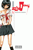
Sundome Vol. 1

Sundome Vol. 1 Created by Kazuto Okada
Created by Kazuto Okada

I've read enough harem and magical girlfriend comedies to notice how creators love to write about romantic couplings that begin from a vantage of inequality. Whether it's the tsundere uppercutting her would-be boyfriend. Or the alien goddess lowering herself to the role of a mere mortal's loyal servant. Or other playful variations of Japan's intricate social hierarchy. But the unconventional relationship in Sundome comes closest to a dominant/submissive sexual partnership. Not that anything explicit actually takes place. The book can be described as one big tease. The title itself when translated into english is "stopping the moment before", which is a generally accurate description of the events in the volume.

Hideo Aiba is your standard wimpy male protagonist found in shonen manga. He's a member of the Roman Club, a group devoted to seeking out boyish adventures such as investigating ghosts, UFOs, and other paranormal mysteries. The members must remain virgins in order to preserve the club's youthful vision. To the rest of the high school's student body, they're just a bunch of otakus. But the club members also maintain high marks in order to get into a good college and have a successful future career. The club's "Old Boys" (school alumni) give out scholarships to members who manage to graduate with their virginity intact. But they also make this goal virtually impossible to achieve by sending "assassins" to strip them of it. Needless to say, these actions foster a certain degree of paranoia.

Then one day the beautiful Kurumi Sahana transfers into Hideo's class. She becomes immediately popular with all the boys in school. Hideo is no exception, and almost quits the club to pursue Kurumi. But when she expresses an interest in joining, he reconsiders. The other members naturally suspect that she might be another assassin, but are too flustered in her presence to object.

Sundome Vol. 1 Created by Kazuto Okada

This silly premise in itself doesn't necessarily separate it from other rom-coms aimed at young readers. But the sexualized imagery certainly does. The story is characterized by juvenile fascination with prurient subject matter. Hideo's infatuation when first meeting Kurumi is expressed through his massive erection, drawn as a fairly obvious bulge in his pants. What perks Kurumi's interest in the club is their secret book on masturbation techniques. And when she confronts Hideo about it, she first asks him to demonstrate how to jerk-off, then rather bluntly states "Even if we were the last two people on Earth, I'd still never have sex with you. No matter how much you beg or cry, I’d never let you come". Hideo accepts these terms as long as it doesn't mean outright rejection. And he happily describes agreeing to this  arrangement as putting on a "collar".

So begins an erotically charged, yet oddly chaste affair. Hideo is so desperate to please Kurumi at every turn that he often performs tasks that are well outside his comfort zone. He willingly courts injury and humiliation to keep himself within Kurumi's good graces, and for the small yet titillating "rewards" she doles out to keep him happy. Kurumi scolds him for showing weakness and praises him when he completes a task. The extremity of this behavior is going to be off-putting to a lot of readers. Manga fans who prefer their rom-coms be more innocent are going to balk at the level of abuse Hideo tolerates. Kazuto Okada doesn't use any of the usual manga tricks to glamorize his characters. While they might be sexualized, they aren't exactly sexy. Kurumi's emaciated form in particular is a gloomy mirror image of the petite figure ideal found in moe manga. All the characters look awkward and twisted, and the mood is exacerbated when they're surrounded with oppressive black stippling. The situations Hideo and the Roman Club face parody conventional manga tropes e.g. the constant panty shots, the indirect kiss, standing up to the school bully, the "test of courage", and other school club hijinks. But they're drained of much of their usual cuteness. And without the PG-13 filters, this brings to the fore the teenage cast's angst and obsession with sex.

Sundome Vol. 1 Created by Kazuto Okada

Towards the end, the promise is held out that there may be more to Kurumi torturing Hideo than mere self-amusement. But the overall mood of this volume is one of abasement punctuated with moments of real intimacy, raunchy humor, and intense slapstick. Most of the adults who read this are going to wonder why Hideo puts up with Kurumi, and it would be hard to argue against the idea that what he needs most is to grow a spine. But beneath the surface, Sundome is a work that adolescents can relate to. Lurking within it's emotionally clumsy narrative is the dawning realization that nurturing a deeper, more mature connection with another human being sometimes involves the discharge of bodily fluids.

11/27/2012

Superman: Earth One Vol. 2

Superman: Earth One Vol. 2, Written by J. Michael Straczynski Penciled by Shane Davis Inked by Sandra Hope Colored by Barbara Ciardo Lettered by Rob Leigh  Superman created by Jerry Siegel and Joe Shuster
Written by J. Michael Straczynski
Penciled by Shane Davis
Inked by Sandra Hope
Colored by Barbara Ciardo
Lettered by Rob Leigh

Superman created by Jerry Siegel and Joe Shuster

Superman: Earth One was a largely uninspired effort - a tweaking of Superman's origin story that didn't really do anything to improve on it. The move to make the destruction of Krypton a result of an act of war added no pathos to Clark Kent/Superman. The book's villain was pretty generic. And the pieces of journalistic writing from Clark and Lois Lane wouldn't have passed muster at a school newsletter, let alone a major metropolitan newspaper. The most notable contribution to the mythos by writer J. Michael Straczynski was the more "emo" interpretation of Clark's personality, something  further explored in Superman: Earth One Volume 2.

In many ways, Straczynski's Clark is a variation of Mark Milton/Hyperion from an earlier Marvel series he penned, Supreme Power. Clark is essentially how Mark would have grown up had he avoided capture by the U.S. military and been raised by the kindly Kents. He still feels emotionally isolated from the rest of humanity because of his superhuman status, even though he decides to help others. The world's governments and ordinary citizens don't trust him. This is the "realism" in Supreme Power that makes it's way to Earth One. It mixes uneasily with Superman's more traditional idealism, resulting in an often passive and unsure protagonist. The visuals also reflect this trend. Artist Shane Davis is no Gary Frank, but his gritty pages look like something that would be more at home in a Batman comic. The color scheme is fairly muted and ugly. Clark with his glasses on looks more nebbish than geek chic. And Superman's physical appearance is closer to the lean athletic type than to the more conventionally bulky bodybuilder ideal.

Superman: Earth One Vol. 2, Written by J. Michael Straczynski Penciled by Shane Davis Inked by Sandra Hope Colored by Barbara Ciardo Lettered by Rob Leigh  Superman created by Jerry Siegel and Joe Shuster

Where vol. 2 surpasses vol. 1 is in having to no longer retell Superman's well-worn origins. Straczynski instead gets to develop the character by tossing around several familiar tropes. While Superman uneasily settles into his role as superhero and world figure, the U.S. military is researching methods to kill him if he ever goes rogue. A suspicious Lois begins to snoop into Clark's background. And Superman finally gets to fight his first Earth-based supervillain, a monstrously creepy re-imagining of the Parasite. These threads don't quite cohere, which makes the story feel more like a serial squeezed into the book format. Superman's eventual solution to a punitive island dictator's rule is closer to the extreme measures of the Authority, and would give everyone else more reason to distrust him. His battle with the Parasite exudes a "monster of the week" vibe. And Lois' investigation peters out as if Straczynski simply ran out of pages for her.

And then there's the issue of how a super strong alien can mate with fragile mere mortals. Clark is given a a new supporting cast as he moves into a new apartment and becomes acquainted with the building's other residents, the most conspicuous being his attractive and flirtatious neighbor Lisa Lasalle. The whole subplot is a not so subtle shout-out to Larry Niven's "Man of Steel, Woman of Kleenex", but not as funny as the original. Highlighting Clark's own frustration at his inability to do the nasty is certainly one way to make his alienation more relatable to the reader. Lisa however is still a one-note character at this point, and the resolution to the sexual tension between them feels way too much like an easy out.

Superman: Earth One Vol. 2, Written by J. Michael Straczynski Penciled by Shane Davis Inked by Sandra Hope Colored by Barbara Ciardo Lettered by Rob Leigh  Superman created by Jerry Siegel and Joe Shuster

So while the book is a slight improvement over its predecessor, it doesn't quite rise to the level that makes it stand out from the already massive pile of preexisting Superman material. It ends with the promise of a newer, shinier version his greatest arch-enemy about to make his life very miserable. Will this make "Superman: Earth One" much better on its third installment? I'm a little skeptical.

11/21/2012

Animation: Fleischer Superman cartoons

Superman by Fleischer Studios
Go to: YouTube, by Warner Bros. (via Joseph Hughes)

These gorgeous animated shorts from the early 1940s hold up amazingly well, even when compared with work created using today's more advanced computer-assisted techniques.

11/17/2012

Where are you, you spongy yellow delicious bastards?

Zombieland (2009)
Tallahassee:  This Twinkie thing, it ain't over yet. - Zombieland
Farewell Hostess. I loved the artificially sweet aftertaste and funny sounding names of your products. If you can't find a buyer, I might still need to learn parkour, like really soon.

Update: As any Canadian already knows, the demise of Hostess doesn't mean their products are no longer sold elsewhere. Americans can still go north of the border to satisfy their craving for Twinkies, Ding DongsHo Hos, and other goodies.

11/13/2012

Webcomic: Nimona

Nimona by Noelle Stevenson
Go to: Nimona by Noelle Stevenson

Ninja Girl Ko! Indie Special #1-2 and Video Girl Ai Vol. 15

Today's reviews are all about the kind of girls shonen manga fantasizes having around the house - inexplicably loyal to the passive male whom they happen to share the same roof.

Ninja Girl Ko! Indie Special #1-2 by Marco Dimaano, Kriss Sison
Ninja Girl Ko! Indie Special #1-2
by Marco Dimaano, Kriss Sison

Ninja Girl Ko! began in the pages of the original pinoy manga anthology Mangaholix in 2007. With that magazine no longer an ongoing concern (as far as I can tell. Their website hasn't been updated lately), series creator Marco Dimaano has decided to go the self-publishing route, resulting in a big drop in production values. Succeeding the previous glossily colored work, NGK lives on as a pair of cheaply-printed minis. Ironically, this change brings the comic much closer to the look and feel of Japanese manga magazines.

NGK takes its cues from traditional shonen tropes from the Eighties. Filipino teenager Anton Alcazaren wanders into the woods during a school excursion, where he runs into Michiko Yamashita, a beautiful kunoichi and surviving daughter of a WWII-era Japanese soldier. At first enraging her with his patented clumsiness, he manages to earn her loyalty by saving her life. Michiko follows Anton back to Manila and becomes his bodyguard/housekeeper. But it isn't long before her presence attracts the unwelcome attention of a shadowy nativist organization called The Kamao. While the premise sounds like the setup to a domestic farce along the lines of Ranma 1/2 or Tenchi Muyo, both the artwork and preference for combat hews closer to later series like Naruto and Bleach.

Ninja Girl Ko! Indie Special #1-2 by Marco Dimaano, Kriss Sison

The story has not yet gotten too far, so the two indie specials are a suitable enough jumping on point for new readers. Prior events are summarized and things pick up where they left of. In order to pay to replace a previously wrecked bike, Michiko enters an underground cage-fighting tournament. She easily thrashes the competition, but is then attacked by an equally skilled escrimador. Naturally, she's also a cute teenage girl. Named Maya Luna, she's later revealed to be working for The Kamao. Much of these two issues is devoted to building her up as a worthy martial arts rival to Michiko. And she's contrasted as the short-haired, genki girl equivalent to Michiko's more reserved personality.

The change in format seems to have freed-up series artist Kriss Sison. He's more willing to break with the grid and utilize a more Japanese style of layout. The results are more elaborately staged fights scenes accompanied by more "decompressed" storytelling. And the computer coloring of the past is now replaced by more straightforward stippling. The upshot though is that the series is now paced like mainstream shonen manga, while subject to the irregular release schedule of an indie comic. This could get much more irritating with the passage of time.


Video Girl Ai Vol. 15 by Masakazu Katsura
Video Girl Ai Vol. 15
by Masakazu Katsura

Any knowledgeable fan who's read Video Girl Ai could have predicted that nonentity/wish fulfillment character Yota Moteuchi would end up with magical helper Ai Amano. That's how the formula goes. How the story arrives at that endpoint is what attracts the reader to a particular series. Masakazu Katsura accomplishes this through a mixture of tortuous personal growth and shameless fan service. Characters are often expressing their niggling insecurities through extended monologues. Then the scene suddenly shifts to someone staring at some cute girl's ass. The pain and suffering isn't always confined to people's headspaces. There are scenes involving actual torture, assault, and attempted rape. Then there's the fantasy elements embodied in Ai. Unlike other would-be magical girlfriends, she exudes spunk. Her tomboyish behavior doesn't make her immediately attractive to Yota, so it's a slight subversion when he begins to favor her over the more traditionally feminine love interest. Not that this hasn't been seen before in romantic comedies were the leads start out hating each other before they fall in love at the end. However, the meaning of Ai's very existence is tied to getting Yota a girlfriend. So when she begins to develop feelings for him, her mission is not only deemed a failure, her life becomes imperiled as well.

The saga of Yota and Ai lasts for an emotionally-laden thirteen volumes. But rather than ending there, the last two volumes of the series feature side stories involving a different cast of characters. I skipped reading Vol. 14, which forms the first part of "Len's Story". I didn't really find that I missed much, as the it mirrors a lot of the main narrative. Hiromu Taguchi is a Yota version 2.0, and is helped by new Video Girl Len Momono, whose personality and appearance is also very similar to Ai's. The main difference is that the emotional issues Hiromu faces are resolved a lot more quickly and with less fuss. The last volume apparently ended with Hiromu thrown into turmoil over rumors about his love interest Ayumi Shirakawa. Vol. 15 starts with Len berating Hiromu for thinking less of Ayumi just because she might not conform to his virginal fantasy of her. It's very candid for a shonen romance. But hey, it turns out that the rumors are lies being spread by Aumi's conniving ex-boyfriend. The ex is confronted. Problem solved. When Hiromu starts to take Ayumi for granted, triggering the couple's first big fight, Len tells him to rediscover what he loves about her through art. Len is a repository of practical dating advice, embodied in a cheerful and assertive teenage girl. It's a more lighthearted approach. But the relative brevity of "Len's Story"  doesn't allow much room for its cast to establish a stronger separate identity from the main cast.

The last story "Video Girl" is actually an early prototype for the entire series. The art is a lot less refined, the visual gags are a bit more obvious, the humor tends towards slapstick, and the characters' personalities are portrayed in broader strokes. Compared to what came after, it fares badly. So it's more of a curiosity than integral reading material.

11/04/2012

Futile

Occupy Comics -by Anna Muckcracker, from Godkiller image for Atari Teenage Riot's Black Flags video
Occupy Comics
Well, it [the Occupy Movement] should have gone on. It should have built and built. It was a great start that didn’t go anywhere, and that’s also tragic — really tragic. It wasn’t the first massive left-wing thing we have seen in a long time because the progressive people signing up for Obama was a massive thing that also failed. Before that, the protests in Seattle in ’99 — people were enthusiastic about that, and that fizzled, too. There’s a larger problem here about why the left can’t get off the ground, take off, failure to launch…  
 ...There’s a bunch of different problems, but one of the problems is that these movements always — somehow — get sucked into the academy. They get taken over by people who are absolutely determined to not speak in a way that is comprehensible to average Americans. In fact, [these are] people who have enormous contempt for average Americans. The whole idea of the left is about empowering average people, and you can’t do that if you despise them. 
- Tom Frank on the irrelevance of the modern Left

10/30/2012

Super Endorsements for 2012

Super Endorsements 2012 by J. Caleb Mozzocco
Go to: Every Day is Like Wednesday by J. Caleb Mozzocco

I probably should also mention Joss Whedon's backhanded endorsement of Mitt Romney, since it's been making the rounds on all the comics blogs. Better brush up on your parkour, just in case.

10/28/2012

Komikon 2012

The Philippine comic industry's largest flea market held its annual Fall event yesterday. I didn't plan to attend, but was able to drop by during the morning rush. I didn't stay long, didn't purchase much, or take many photos, So I don't have much to say. Komikon was held at the Bayanihan Center again, and I noticed some changes to the event this year. Here are a few hasty observations:

Komikon has always had problems facilitating smooth foot traffic, even in the Bayanihan Center. The exhibitor tables are placed too close together. This year, they tried to alleviate some of this by exiling some of their exhibitors to the smaller conference rooms, namely the Indie Tiangge (Indie Comics) and Komiks Kalye (Artists Alley) sections. And the event still felt like it was at capacity.

I still don't see the point of Komiks Kalye, other than to sell pricey sketches. See my comments from last year.

Seriously, every nook and cranny of the building was being used for something. A whole bunch of local booksellers were crowded in the lobby, just outside the entrance to the main hall, next to the food vendors. I felt pretty bad for them.

Then there was a makeshift studio set up for attendees to pose as if they're characters on a comic book cover. Apparently there was some contest organized between the convention and the photo studio. Not sure about the point of that either.

They skimped on printing an event guidebook this year, or I didn't receive one. I did notice that they were handing out an official tote bag, free to the first one hundred attendees. 100 PHP for everyone else. No way was I paying for that.

The one thing I regret not buying was the Kate Beaton book. What can I say? Poverty sucks.

On to the photos. I saw the usual mixture of familiar faces and ambitious newcomers hawking their minis and graphic novels. I was unable to label the exhibitors for this year. But if you're one of the people pictured below, drop me a line and I'll identify you in this post.

Ninja Girl Ko!, Komikon 2012
Exhibit Hall, Komikon 2012
Kanto Inc., Exhibit Hall, Komikon 2012
Tepai Pascual, Exhibit Hall, Komikon 2012
Exhibit Hall, Komikon 2012
Callous, Exhibit Hall, Komikon 2012
Trese, Exhibit Hall, Komikon 2012
Exhibit Hall, Komikon 2012
Tondo Drift, Exhibit Hall, Komikon 2012