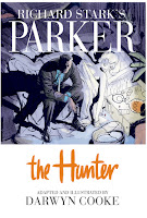
I've never read any of Donald Westlake's novels, let alone his Parker series which he penned under the pseudonym Richard Stark. And even after reading this adaptation of The Hunter by Darwyn Cooke, I'm not about to start. So I'm in no position to judge the faithfulness of the adaptation. But this is still a comic book, and I have an opinion about whether Cooke's art is able to effectively tell its story.
First of, the story in itself sounds perfectly straightforward. After spending time in prison, master thief Parker tracks down the people who double-crossed him and left him for dead after the completion of a successful heist. Parker is neither a flawed anti-hero nor a sympathetic character (He was planning to carry-out his own double-cross). Actually he's not much of a character at all. But he's the perfect embodiment of the male revenge fantasy. While not sadistically cruel, he's ruthlessly efficient: Methodically applying bullying tactics and brute force to get his way. His only weakness is an emotional attachment to his wife, and that's eliminated early, which allows him to become a pure expression of male power. It's in line with much of the kind of adolescent indulgence comic books have been supplying for decades, and it works pretty well even though Parker's ability to get his way has the effect of deflating some of the dramatic tension towards the end of the story. Such are the pitfalls of writing a protagonist who reveals little of his inner life.
Parker's hard exterior is strongly conveyed by some incredibly terse dialogue, such as the one he has with his wife. I'm going to assume this is at least partially a carry-over from the source material:
Such brutal and minimal dialogue can certainly do with some equally effective art. Cooke's art has always struck me as the kind that works as the occasional narrative illustration or pin-up. At the beginning, he puts on a virtuosic display in a wordless dozen-page sequence to establish Parker's entrance into New York City. It's beautifully drawn and nothing in the rest of the comic matches these pages:
But there's always been something a bit too clean about Cooke's animation-influenced character design. His women are all small-waisted mid-century dolls, such as this waitress from the opening sequence:
It's not clear to me how much of that is due to Cooke's own predilections, the pre-feminist ethos of the novel, or a calculated move to appeal to the Direct Market. While his male characters, not surprisingly, posses more physical variety, even Parker, who's almost always cast with a menacing five-o-clock shadow is still drawn to look like a generic action hero:
One effect of Cooke's style is to mute much of the violence in the book. In part this is because he eschews more graphic portrayals and chooses to obscure these acts in silhouette or behind an object. But his drawings are just stylized enough to look almost bloodless. In the case of several explicit acts of physical abuse against women, not a mark is to be found to ruin their beauty despite being hit in the face. And Cooke avoids lingering too long on the victim after the act is committed.
An artist working with a limited palette is always a difficult challenge, and I certainly admire Cooke for making a valiant attempt. But the turquoise wash he applies is hit or miss. It can sometimes strengthen the composition. But other times, when the panels and figures become smaller, it can make it harder to decipher the action. This is because his washes are often applied with the same weight, and the results, especially when viewed from a distance as a two-page spread can look muddy. Interestingly enough the cover is given a more varied and vibrant color treatment, which leaves me wondering what the finished product would be like if this approach were used for the interior art as well.
Because of the monotony of the book's tonal scheme, a halftone pattern is used to differentiate the flashback sequences from the contemporary actions. I don't think this works as well as hoped, but only serves to make them slightly less legible. And this isn't helped by the decision to not give any of the panels a solid border. There's nothing wrong with the technique in itself. But when applied throughout the story and combined with Cooke's already broad strokes and flat color washes, it can exacerbate some of the muddying effect.
Below is an important sequence where Parker confronts his main betrayer. Cooke moves the camera point-of-view around like a film storyboard. It should be a powerful moment. But the differently sized panels bleed into another, making it much harder to follow the already confusing jumps between each character. Their actions look stiff. And the backgrounds so nonexistent as to make it difficult to ground them in a particular environment. It's a disappointing scene considering how much stronger the art was earlier in the book.
I'm emotionally stunted enough to be enjoy the premise of the book, and followed it with interest to the end. I do think Darwyn Cooke is a solid artist. The Hunter is a good, entertaining read, but falls short of being a truly great work. It's beautiful in parts, but not all of it works as well.


