Go to: Time (via Kate Beaton)
7/11/2015
7/10/2015
Comic-Con Album Pt 25
![]() |
| Cindy Freeling, Comic-Con autograph area. |
Located across from the Portfolio Review Area, Comic-Con's Autograph Area is the pop culture equivalent of Artist's Alley - A motley gathering of celebrities, starlets, has-beens, and ne'er-do-wells detached from the madness of the main exhibit hall. Some of them can be very charming, such as the lovely lady pictured above. Most of the time, the atmosphere of the hall is relatively sedate.
Speaking of has-beens - I don't remember at which Comic-Con this took place at, but I once spotted Wil Wheaton when I was rushing between review sessions. These were still the lean years before Wil's tireless blogging and courting of the Web 1.0 crowd would catapult him to nerdlebrity status. This was before Nemesis. Before w00tstock. Before The Guild. Before geeks conquered the media landscape. Those days were filled with high anxiety, self-doubt, narcissistic brooding, fannish nostalgia, and a pathological disconnect as narrated with a heavy dose of self-depreciating humour in his autobiography several years later. Of course, I didn't know that at the time. To me he was just the actor formerly known as Wesley Crusher.
Wil's table was located so that he was split off from the majority of the autograph group, his table facing so that his back was turned towards them. Wil didn't have any immediate neighbours to either side of him. Well, at least I didn't see anyone when I was there. He was alone. And he looked utterly miserable just sitting there. A part of me wanted to walk up to him, say "hi", and tell him that not everyone hated him when he was on ST:TNG. But a bigger part of me felt awkward about approaching someone in such a state, felt unsure about how to reach out. I was too wrapped up in my own personal shit at the time. And I've gradually realised that I'm not the most empathic individual. Or maybe I was just paralysed by a sense of impotence to help. So I moved on to whatever it was I was currently occupied with.
An that's why I don't have a picture of Uncle Willy.
Pt 15, 16, 17, 18, 19, 20, 21, 22, 23, 24
Video: How to Make It as a Cartoonist
Go to: Time (via Kate Beaton)
7/09/2015
Comic-Con Album Pt 24
![]() |
| Saya PVC, Comic-Con exhibit hall. |
So many anime-based toys in one place. And not nearly enough cash to buy them. I'm not a very avid toy collector, but Comic-Con sorely tests my resistance to unbridled consumerism with it's sheer variety of merch being sold. I suppose a lot of attendees can relate to that scene in Paul were Clive Gollings lovingly eyes a katana, only to put it back down when the vendor informs him about its retail price. But it's the little things you can afford that begins to add up once you try to get them all.
Pt 15, 16, 17, 18, 19, 20, 21, 22, 23
Doctor Fate #1 and Superman #41
Doctor Fate #1
Writer: Paul Levitz, Sonny Liew
Artist: Sonny Liew, Ibrahim Moustafa
Colors: Lee Loughridge
Letters: Nick J. Napolitano
Doctor Fate created by Gardner Fox and Howard Sherman.
I like the idea of Doctor Fate more than I like the character itself. In reality he doesn't distinguish himself enough from all the other sorcerer supreme types. The DC Universe is awash with magicians from decades of continuity - lone wolf John Constantine (until he joined Justice League Dark) currently being the most popular character to come from their ranks. On the other hand, Fate is traditionally associated with the Justice Society of America. But I haven't been keeping up with that group, post Flashpoint, or know if they even still exist. So can veteran writer Paul Levitz infuse a more unique perspective onto such a staid figure? Not yet, judging from this issue.
The new Fate is a NYC resident and pre-med student Khalid Nassour, called on by ancient Egyptian goddess Bastet to fulfill his destiny by donning the magical helmet and fight against her evil counterpart Anubis. The latter seems intent on initiating a new worldwide deluge. Yeah, it's not a very original good vs. evil set-up for a superhero comic. And its use of mythology already feels old fashioned in our post-Neil Gaiman/Alan Moore era. Levitz is clearly attempting to make his characters sound more relevant and hip (and look, they're texting each other with their smartphones). But the for now, Khalid comes across as little more than a cipher for the reluctant hero.
If the dialogue can be a tad generic, the title's promise comes from new artist Sonny Liew. I'm pleased to see the current DC regime moving away from the baroque New 52 house style. Liew's emaciated forms combined with Lee Loughridge's strong colors produce an unsettling psychedelic effect, which compliments the story's fantastic milieu. But here's hoping Khalid does something more interesting with his costume, which for now is just him wearing the helmet over his normal street clothes.
Superman #41
Writer: Gene Luen Yang
Artist: John Romita Jr., Karl Kerschl
Inker: Klaus Janson
Colors: Dean White
Letters: Rob Leigh
Superman created by Jerry Siegel and Joe Shuster.
A source of potential confusion over DC's handling of Superman is that the character is spread over several interconnected monthly titles. A story arc which began in one title is picked up by another. Several weeks ago, Superman's status quo was drastically altered in the pages of Action Comics #41. This involved among other things, a reduction of his powers and a change in costume. The new status quo was explored in Batman/Superman and Superman/Wonder Woman. But it's only with the recent release of Superman #41 has the cause of the change being revealed, though only partially.
The task of explicating this part of Superman's collectively molded saga is given to newcomer Gene Luen Yang. He joins the already established art team led by John Romita Jr., which lends a sense of continuity because the Superman title hasn't been able to hold on to its writers for very long since George Pérez took over in 2011. Romita and inker Klaus Janson imbue the character with a certain gritty dynamism and down-to-earth presence - qualities not usually associated with past portrayals from the character's more well-known artists.
But it's Yang who's the revelation here. Having established himself in the industry with critically lauded creator-owned passion projects, a high profile corporate property like Superman is uncharted territory for him and his fans. But Yang acquits himself very well, easily updating the well-established relationships between Clark Kent, Jimmy Olsen, and Lois Lane with relaxed, informal, and youthful banter (though Jimmy's use of a smartphone over a DSLR/ILC was ridiculous). I like how Lois rather quickly insinuates herself into an investigation the former two are secretly conducting. The story pays homage to Superman's early crusades against corrupt politicians and arms dealers, as well as the character's propensity to fight giant killer robots. There might be hope that the Superman title will finally have some stability if DC can retain Yang.
Writer: Paul Levitz, Sonny Liew
Artist: Sonny Liew, Ibrahim Moustafa
Colors: Lee Loughridge
Letters: Nick J. Napolitano
Doctor Fate created by Gardner Fox and Howard Sherman.
I like the idea of Doctor Fate more than I like the character itself. In reality he doesn't distinguish himself enough from all the other sorcerer supreme types. The DC Universe is awash with magicians from decades of continuity - lone wolf John Constantine (until he joined Justice League Dark) currently being the most popular character to come from their ranks. On the other hand, Fate is traditionally associated with the Justice Society of America. But I haven't been keeping up with that group, post Flashpoint, or know if they even still exist. So can veteran writer Paul Levitz infuse a more unique perspective onto such a staid figure? Not yet, judging from this issue.
The new Fate is a NYC resident and pre-med student Khalid Nassour, called on by ancient Egyptian goddess Bastet to fulfill his destiny by donning the magical helmet and fight against her evil counterpart Anubis. The latter seems intent on initiating a new worldwide deluge. Yeah, it's not a very original good vs. evil set-up for a superhero comic. And its use of mythology already feels old fashioned in our post-Neil Gaiman/Alan Moore era. Levitz is clearly attempting to make his characters sound more relevant and hip (and look, they're texting each other with their smartphones). But the for now, Khalid comes across as little more than a cipher for the reluctant hero.
If the dialogue can be a tad generic, the title's promise comes from new artist Sonny Liew. I'm pleased to see the current DC regime moving away from the baroque New 52 house style. Liew's emaciated forms combined with Lee Loughridge's strong colors produce an unsettling psychedelic effect, which compliments the story's fantastic milieu. But here's hoping Khalid does something more interesting with his costume, which for now is just him wearing the helmet over his normal street clothes.
Superman #41
Writer: Gene Luen Yang
Artist: John Romita Jr., Karl Kerschl
Inker: Klaus Janson
Colors: Dean White
Letters: Rob Leigh
Superman created by Jerry Siegel and Joe Shuster.
A source of potential confusion over DC's handling of Superman is that the character is spread over several interconnected monthly titles. A story arc which began in one title is picked up by another. Several weeks ago, Superman's status quo was drastically altered in the pages of Action Comics #41. This involved among other things, a reduction of his powers and a change in costume. The new status quo was explored in Batman/Superman and Superman/Wonder Woman. But it's only with the recent release of Superman #41 has the cause of the change being revealed, though only partially.
The task of explicating this part of Superman's collectively molded saga is given to newcomer Gene Luen Yang. He joins the already established art team led by John Romita Jr., which lends a sense of continuity because the Superman title hasn't been able to hold on to its writers for very long since George Pérez took over in 2011. Romita and inker Klaus Janson imbue the character with a certain gritty dynamism and down-to-earth presence - qualities not usually associated with past portrayals from the character's more well-known artists.
But it's Yang who's the revelation here. Having established himself in the industry with critically lauded creator-owned passion projects, a high profile corporate property like Superman is uncharted territory for him and his fans. But Yang acquits himself very well, easily updating the well-established relationships between Clark Kent, Jimmy Olsen, and Lois Lane with relaxed, informal, and youthful banter (though Jimmy's use of a smartphone over a DSLR/ILC was ridiculous). I like how Lois rather quickly insinuates herself into an investigation the former two are secretly conducting. The story pays homage to Superman's early crusades against corrupt politicians and arms dealers, as well as the character's propensity to fight giant killer robots. There might be hope that the Superman title will finally have some stability if DC can retain Yang.
7/08/2015
7/07/2015
7/06/2015
7/04/2015
Black Canary #1 and Justice League of America #1
Black Canary #1
Story: Brenden Fletcher
Art: Annie Wu, Tula Lotay
Colors: Lee Loughridge
Letters: Steve Wands
Black Canary/Dinah Drake Lance created by Robert Kanigher and Carmine Infantino.
Black Canary is one of those ensemble characters DC keeps pushing from time to time as a star in her own right. Most of those efforts tend to focus on her skills as one of the world's foremost martial artists/covert operatives. Nothing wrong with that since the premise provides an excuse to show lots of kick-butt action. It's just that it's well trod territory. This latest relaunch still references those chop-sockey roots, but adds a twist which so effectively sets the character apart from the DC stable it has me wondering why no one's ever tried it before. Actually, I've probably answered my own question.
Basically, Dinah Drake or "D.D." is now the frontwoman for a rock band called "Black Canary." The new series can be considered a spinoff of Batgirl, where she was a supporting character for a bit. Brenden Fletcher nonetheless avoids making any explicit connection or even mention to her New 52 history. So it's a little unclear how much of it still applies to her. Just as well. Dinah is portrayed as an enigmatic figure hinting at a mysterious but troubled past. She still beats up a lot of bad guys, oftentimes while still on stage.
As with Batgirl, Fletcher eschews the company's house style for something a bit more alternative in flavour. And as with that series, the art team is largely responsible for making its premise work. Annie Wu's roughly hewn linework combined with Lee Loughridge's bold splashes of bright colors perfectly captures the youthful energy and gritty atmosphere of an indie rock concert. Under Wu's deft hand, Dinah's traditional black costume is subtly altered to look less like a circus outfit worn by a pulp heroine from the 40s and more like something a punk musician would put on for a live performance. And Steve Wand's typography completes the effect by helpfully repurposing some of the page layouts to look more like music posters.
This is an enjoyable reimagining of an already familiar character. It's such a departure from previous incarnations that more knowledgeable fans might feel at a loss trying to relate Dinah the rocker to past decades or even the last few years of continuity. So the comic is best read by anyone who can come to it with the fewest preconceptions about the character.
Justice League of America #1
Story: Bryan Hitch
Art: Bryan Hitch, Howard Porter
Inks: Daniel Henriques, Wade von Grawbadger, Andrew Currie
Colors: Alex Sinclair, Jeromy Cox
Letters: Chris Eliopoulos
Justice League of America created by Gardner Fox.
This double sized issue seems to ignore whatever changes to the status quo were brought about by the DC You relaunch and goes to heart of what makes the Justice League of America appealing to fans: Some of DC's most famous characters tackling a menace none of them could handle alone. This a classic superhero throwdown with just enough intrigue injected into the proceedings to help break up the monotony of the action and suggest even more ominous forces behind the immediate threat actively working to undermine the team.
The issue's extended length allows for Bryan Hitch to employ his panoramic approach to storytelling. He's assisted by three inkers and two colorists to embellish his detailed, photorealistic art. This results in the faces being a little less consistent and refined. Could the story have been told with a smaller page count? Sure. The pacing is somewhat disjointed, and the plot becomes convoluted towards the end. But much of Hitch's appeal comes from his expansive layouts and grandiose set pieces. The additional space is utilized to showcase each Justice League member's contrasting personalities, abilities and weaknesses. The climactic battle sequence emits a real sense of danger as each of them is taken down by an unexpectedly amped-up villain.
Whatever problems this issue has in terms of plotting, characterization, continuity or pricing ($5.99 is pretty hefty for a pamphlet), there’s something satisfying in reading an iconic approach to such well-established characters. And it's kind of entertaining to see DC indulging one of its marquee creators as he goes for broke, especially after a long absence from the title.
Story: Brenden Fletcher
Art: Annie Wu, Tula Lotay
Colors: Lee Loughridge
Letters: Steve Wands
Black Canary/Dinah Drake Lance created by Robert Kanigher and Carmine Infantino.
Black Canary is one of those ensemble characters DC keeps pushing from time to time as a star in her own right. Most of those efforts tend to focus on her skills as one of the world's foremost martial artists/covert operatives. Nothing wrong with that since the premise provides an excuse to show lots of kick-butt action. It's just that it's well trod territory. This latest relaunch still references those chop-sockey roots, but adds a twist which so effectively sets the character apart from the DC stable it has me wondering why no one's ever tried it before. Actually, I've probably answered my own question.
Basically, Dinah Drake or "D.D." is now the frontwoman for a rock band called "Black Canary." The new series can be considered a spinoff of Batgirl, where she was a supporting character for a bit. Brenden Fletcher nonetheless avoids making any explicit connection or even mention to her New 52 history. So it's a little unclear how much of it still applies to her. Just as well. Dinah is portrayed as an enigmatic figure hinting at a mysterious but troubled past. She still beats up a lot of bad guys, oftentimes while still on stage.
As with Batgirl, Fletcher eschews the company's house style for something a bit more alternative in flavour. And as with that series, the art team is largely responsible for making its premise work. Annie Wu's roughly hewn linework combined with Lee Loughridge's bold splashes of bright colors perfectly captures the youthful energy and gritty atmosphere of an indie rock concert. Under Wu's deft hand, Dinah's traditional black costume is subtly altered to look less like a circus outfit worn by a pulp heroine from the 40s and more like something a punk musician would put on for a live performance. And Steve Wand's typography completes the effect by helpfully repurposing some of the page layouts to look more like music posters.
This is an enjoyable reimagining of an already familiar character. It's such a departure from previous incarnations that more knowledgeable fans might feel at a loss trying to relate Dinah the rocker to past decades or even the last few years of continuity. So the comic is best read by anyone who can come to it with the fewest preconceptions about the character.
Justice League of America #1
Story: Bryan Hitch
Art: Bryan Hitch, Howard Porter
Inks: Daniel Henriques, Wade von Grawbadger, Andrew Currie
Colors: Alex Sinclair, Jeromy Cox
Letters: Chris Eliopoulos
Justice League of America created by Gardner Fox.
This double sized issue seems to ignore whatever changes to the status quo were brought about by the DC You relaunch and goes to heart of what makes the Justice League of America appealing to fans: Some of DC's most famous characters tackling a menace none of them could handle alone. This a classic superhero throwdown with just enough intrigue injected into the proceedings to help break up the monotony of the action and suggest even more ominous forces behind the immediate threat actively working to undermine the team.
The issue's extended length allows for Bryan Hitch to employ his panoramic approach to storytelling. He's assisted by three inkers and two colorists to embellish his detailed, photorealistic art. This results in the faces being a little less consistent and refined. Could the story have been told with a smaller page count? Sure. The pacing is somewhat disjointed, and the plot becomes convoluted towards the end. But much of Hitch's appeal comes from his expansive layouts and grandiose set pieces. The additional space is utilized to showcase each Justice League member's contrasting personalities, abilities and weaknesses. The climactic battle sequence emits a real sense of danger as each of them is taken down by an unexpectedly amped-up villain.
Whatever problems this issue has in terms of plotting, characterization, continuity or pricing ($5.99 is pretty hefty for a pamphlet), there’s something satisfying in reading an iconic approach to such well-established characters. And it's kind of entertaining to see DC indulging one of its marquee creators as he goes for broke, especially after a long absence from the title.
7/03/2015
Comic-Con Album Pt 20
7/02/2015
Comic-Con Album Pt 19
![]() |
| The Christopher Moeller table at Artist's Alley, Comic-Con exhibit hall. |
I hope he sold enough to at least break even.
Pt 15, 16, 17, 18
7/01/2015
Comic-Con Album Pt 18
6/30/2015
Comic-Con Album Pt 17
![]() |
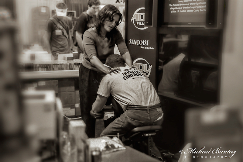
| A Friend in Knead, Comic-Con exhibit hall. |
I doubt many younger fans will recognise ADV Films a.k.a. A.D. Vision anymore. But I still own a few of their DVDs. Should probably replace them with higher resolution versions. That's how they make their money.
Pt 15, 16
Webcomic: Fun with Flags
Go to: Ty Templeton's ART LAND (via Tom Spurgeon)
6/29/2015
6/26/2015
Comic-Con Album Pt 15
![]() |
| Spider-Man cosplay at the Marvel booth, Comic-Con exhibit hall. |
The proceeding photos in the series were taken at the next Comic-Con I attended. Ready to take a trip down memory lane? It's been a while since the last instalment.
Remember the Ultimate Universe? I heard it's going away now. Except for Spidey. Just not the one pictured here.
For the previous photos of the series, go here:
Pt 1, 2, 3, 4, 5, 6, 7, 8, 9, 10, 11, 12, 13, 14
6/24/2015
Prez #1 and Starfire #1
Prez #1
Writer: Mark Russell
Artist: Ben Caldwell
Inker: Mark Morales
Colorist: Jeremy Lawson
Letterer: Travis Lanham
Prez Rickard created by Joe Simon and Jerry Grandenetti
Perhaps the most unusual series to emerge out of the DC You initiative, Prez bears little resemblance to the original Prez Rickard from 1973. Set in the year 2036, the comic isn't a realistic futurist projection but a harsh satire about the shallowness of our Web 2.0 culture. Media saturation has led to a further loss of empathy and the intensifying of the craving for loud spectacle. Citizens are disengaged while they let mega corporations invade their privacy and corrupt the political process. It's a pretty bleak view of current technological trends. As one pundit puts it "This country just gets stupider." But it's what allows for a teenage girl called Beth Ross to fail her way up to the White House. I'm curious to see whether or not the story will transcend such cynicism.
Prez spends more time molding the textures of its fictional world than with its protagonist. A senator proposes replacing food stamps with "taco drones" to deliver unhealthy corporate fast food to the poor and monitor them at the same time. One presidential candidate agrees to getting paddled in the rear during a popular vodcast in a desperate bid to win over Ohio voters, another appears on a game show where contestants perform a series of increasingly dangerous stunts in order to win a billion dollars. While some of this can seem hamfisted, Mark Russell's one liners quickly convey how entertainment values erode substantive debate. To wit, that horrific game show is reduced by its guest to a glib sentiment "proof that anyone can succeed in America if they just try hard enough!"
As little as we get to see Beth do anything proactive, Ben Caldwell still manages to portray her as a sympathetic character. His cartooning style which blends Disney with a dash of manga imbues Beth with a wide-eyed, naĂŻf vulnerability. It helps that her defining character trait is a capacity for self-sacrifice. But Caldwell's delicate linework also succeeds in capturing the absurdity demanded of the story and give it an edgy fairy tale quality.
Starfire #1
Writer: Amanda Conner, Jimmy Palmiotti
Artist: Emanuela Lupacchino, Amanda Conner, Paul Mounts
Inker: Ray McCarthy
Colorist: Hi-Fi
Letters: Tom Napolitano
Starfire/Koriand'r created by Marv Wolfman and George Pérez
I don't know if the post-Convergence DC Universe is meant to be a soft reboot or if it's still even a universe at this point, but I was surprised that this series completely ignores Starfire's previous New 52 incarnation. Then again, given the significant negative attention that particular version garnered, it's understandable why the publisher decided to drastically change course. So Amanda Connor et al. had to clear a very low bar. For all intents, this Starfire has gone back to the beginning as a veritable newcomer trying to adjust to life on Earth.
This Starfire is based mostly on the popular animated Teen Titans series with a bit of the original Marv Wolfman/George Pérez comic character shining through. A lot of the humor is centered around misunderstandings arising from Starfire's unfamiliarity with Earth customs and a tendency to take English language idioms a little too literally. It's a well worn trope, but at least it's not a hot mess. Starfire might be naive, but she's no ditz. When a fight breaks out between two men vying for her attention, she knocks some sense into them with one well aimed (but nonlethal) starbolt.
This is a new series which goes out of its way to be welcoming to new readers. I still miss Connor's comic touch as an artist, even though Emanuela Lupacchino draws a Starfire who's both sweet and unselfconsciously seductive. The issue begins with a two page recap of her alien origins, then proceeds to situate her in a new setting filled with new supporting characters. It's actually a little weird how willing they are to help her. Inker Ray McCarthy and the colors of Hi-Fi give everything a very bright and glossy finish. In fact, the comic looks and feels less like a superhero adventure and more like a cute magical girl comedy. For a DC mainstream title, that's a bold new direction.
Writer: Mark Russell
Artist: Ben Caldwell
Inker: Mark Morales
Colorist: Jeremy Lawson
Letterer: Travis Lanham
Prez Rickard created by Joe Simon and Jerry Grandenetti
Perhaps the most unusual series to emerge out of the DC You initiative, Prez bears little resemblance to the original Prez Rickard from 1973. Set in the year 2036, the comic isn't a realistic futurist projection but a harsh satire about the shallowness of our Web 2.0 culture. Media saturation has led to a further loss of empathy and the intensifying of the craving for loud spectacle. Citizens are disengaged while they let mega corporations invade their privacy and corrupt the political process. It's a pretty bleak view of current technological trends. As one pundit puts it "This country just gets stupider." But it's what allows for a teenage girl called Beth Ross to fail her way up to the White House. I'm curious to see whether or not the story will transcend such cynicism.
Prez spends more time molding the textures of its fictional world than with its protagonist. A senator proposes replacing food stamps with "taco drones" to deliver unhealthy corporate fast food to the poor and monitor them at the same time. One presidential candidate agrees to getting paddled in the rear during a popular vodcast in a desperate bid to win over Ohio voters, another appears on a game show where contestants perform a series of increasingly dangerous stunts in order to win a billion dollars. While some of this can seem hamfisted, Mark Russell's one liners quickly convey how entertainment values erode substantive debate. To wit, that horrific game show is reduced by its guest to a glib sentiment "proof that anyone can succeed in America if they just try hard enough!"
As little as we get to see Beth do anything proactive, Ben Caldwell still manages to portray her as a sympathetic character. His cartooning style which blends Disney with a dash of manga imbues Beth with a wide-eyed, naĂŻf vulnerability. It helps that her defining character trait is a capacity for self-sacrifice. But Caldwell's delicate linework also succeeds in capturing the absurdity demanded of the story and give it an edgy fairy tale quality.
Starfire #1
Writer: Amanda Conner, Jimmy Palmiotti
Artist: Emanuela Lupacchino, Amanda Conner, Paul Mounts
Inker: Ray McCarthy
Colorist: Hi-Fi
Letters: Tom Napolitano
Starfire/Koriand'r created by Marv Wolfman and George Pérez
I don't know if the post-Convergence DC Universe is meant to be a soft reboot or if it's still even a universe at this point, but I was surprised that this series completely ignores Starfire's previous New 52 incarnation. Then again, given the significant negative attention that particular version garnered, it's understandable why the publisher decided to drastically change course. So Amanda Connor et al. had to clear a very low bar. For all intents, this Starfire has gone back to the beginning as a veritable newcomer trying to adjust to life on Earth.
This Starfire is based mostly on the popular animated Teen Titans series with a bit of the original Marv Wolfman/George Pérez comic character shining through. A lot of the humor is centered around misunderstandings arising from Starfire's unfamiliarity with Earth customs and a tendency to take English language idioms a little too literally. It's a well worn trope, but at least it's not a hot mess. Starfire might be naive, but she's no ditz. When a fight breaks out between two men vying for her attention, she knocks some sense into them with one well aimed (but nonlethal) starbolt.
This is a new series which goes out of its way to be welcoming to new readers. I still miss Connor's comic touch as an artist, even though Emanuela Lupacchino draws a Starfire who's both sweet and unselfconsciously seductive. The issue begins with a two page recap of her alien origins, then proceeds to situate her in a new setting filled with new supporting characters. It's actually a little weird how willing they are to help her. Inker Ray McCarthy and the colors of Hi-Fi give everything a very bright and glossy finish. In fact, the comic looks and feels less like a superhero adventure and more like a cute magical girl comedy. For a DC mainstream title, that's a bold new direction.
6/20/2015
Avatar The Last Airbender: The Rift
Writer: Gene Luen Yang, Michael Dante DiMartino, Bryan Konietzko
Artist: Gurihiru
Letterer: Michael Heisler
Avatar: The Last Airbender created by Michael Dante DiMartino and Bryan Konietzko
The Rift is the third Avatar story after The Promise and The Search told by Gene Yang and Gurihiru. So it's become clear that this creative team's working within a very rigid framework. Contort the narrative to fit the three part structure. Start slow. Pad the story with subplots and evenly spaced revelations. Finish with a big fight that pushes the combatants into an understanding of sorts. The results so far have been somewhat underwhelming. The comics are burdened with an unfortunate sensation that their plots are warped to fit the page count and are a tad emotionally manipulative. With that said, The Rift is still their best effort yet. This is primarily because of the presence of fan favourite Toph Beifong to liven up the proceedings.
One of the biggest shortcomings with the graphic novel series is the generally flat character development of its main cast. These once rebellious teens have since settled into boring adult roles after the conclusion of the animated series. In The Promise, both Aang and Zuko are surprisingly bereft of any agency as they're driven into a conflict dictated by their responsibilities to opposing factions and the expectations hoisted upon them by their respective followers. Neither have since regained the irrepressible energy that characterized their televised incarnations and drove the entire series. the independent Katara has been reduced to supportive girlfriend with no voice of her own. And her quick witted brother Sokka has been largely stuck in odious comic relief mode.
Only Toph escapes this fate by striking out on her own. She's first shown establishing her metalbending academy in The Promise, and the fruits of her labour are revealed in The Rift. She's the only significant character who's comfortable contradicting Aang, and the primary conflict for this arc is made more personal because it arises from the differences between the two. Aang's the spiritualist always striving to make everyone happy while Toph's the materialist willing to buck tradition.
What sets this up is Aang's attempt to revive an important Air Nomad festival. He unexpectedly discovers that the ritual's once sacred site is now the address of a rapidly expanding factory town. Aang then detects the presence of a disapproving spirit and moves to shut the factory down. But he's stymied by Toph. While Aang quickly blames the factory for the area's spiritual pollution, Toph sees little point in continuing a custom that apparently serves no purpose while noting the real socio-economic benefits of the factory to the local community. Their opposing points of view puts them at odds with each other, giving the story an emotional edge missing in the similarly themed The Promise and generates a tone of moral ambiguity that can't be neatly resolved by either side.
At the same time, the story is one huge nod to continuity. The Last Airbender was about Aang fighting a burgeoning industrial state waging a war of conquest on the entire world, while Legend of Korra is about Aang's successor working within a multiethnic society caught up in the midst of intense industrialization. The Rift is a bridge meant to reconcile these two settings and explains how the Earth Kingdom and Water Tribes became enthusiastic supporters of technological progress. There's an evil Fire Nation capitalist who serves as the story's principal villain, but he feels very much like a throwback to an earlier era. Who cares about him when the story involves young metalbenders duking it out with one hundred foot tall spirits?
That shock of the new is the story's most notable feature. Gurihiru has done a fine job so far in tweaking the ATLA universe. But now they get to introduce a few modern elements. When the cast first sets their eyes on the factory, it just feels wrong standing there. There's nothing extraordinary about it from the outside for anyone who lives in the real world. It's just another grimy building. It's just that in this fantastical setting it feels like a desecration. A pox on the natural beauty of the landscape. Something only an abusive Fire Lord could love.
But as Aang is given a tour of the facilities by an enthusiastic (and way too oblivious for his own good) chief engineer, he witnesses something he's been striving so hard to achieve all this time now being independently realized: balance, harmony. People from the surviving three nations coming together and working towards a common goal on the factory floor. More so than when he first visited the town of Yu Dao back in the first comic, Aang must learn a few bittersweet lessons. Change is inevitable. People adapt. And things don't always work out the way you intended it.
Artist: Gurihiru
Letterer: Michael Heisler
Avatar: The Last Airbender created by Michael Dante DiMartino and Bryan Konietzko
The Rift is the third Avatar story after The Promise and The Search told by Gene Yang and Gurihiru. So it's become clear that this creative team's working within a very rigid framework. Contort the narrative to fit the three part structure. Start slow. Pad the story with subplots and evenly spaced revelations. Finish with a big fight that pushes the combatants into an understanding of sorts. The results so far have been somewhat underwhelming. The comics are burdened with an unfortunate sensation that their plots are warped to fit the page count and are a tad emotionally manipulative. With that said, The Rift is still their best effort yet. This is primarily because of the presence of fan favourite Toph Beifong to liven up the proceedings.
One of the biggest shortcomings with the graphic novel series is the generally flat character development of its main cast. These once rebellious teens have since settled into boring adult roles after the conclusion of the animated series. In The Promise, both Aang and Zuko are surprisingly bereft of any agency as they're driven into a conflict dictated by their responsibilities to opposing factions and the expectations hoisted upon them by their respective followers. Neither have since regained the irrepressible energy that characterized their televised incarnations and drove the entire series. the independent Katara has been reduced to supportive girlfriend with no voice of her own. And her quick witted brother Sokka has been largely stuck in odious comic relief mode.
Only Toph escapes this fate by striking out on her own. She's first shown establishing her metalbending academy in The Promise, and the fruits of her labour are revealed in The Rift. She's the only significant character who's comfortable contradicting Aang, and the primary conflict for this arc is made more personal because it arises from the differences between the two. Aang's the spiritualist always striving to make everyone happy while Toph's the materialist willing to buck tradition.
What sets this up is Aang's attempt to revive an important Air Nomad festival. He unexpectedly discovers that the ritual's once sacred site is now the address of a rapidly expanding factory town. Aang then detects the presence of a disapproving spirit and moves to shut the factory down. But he's stymied by Toph. While Aang quickly blames the factory for the area's spiritual pollution, Toph sees little point in continuing a custom that apparently serves no purpose while noting the real socio-economic benefits of the factory to the local community. Their opposing points of view puts them at odds with each other, giving the story an emotional edge missing in the similarly themed The Promise and generates a tone of moral ambiguity that can't be neatly resolved by either side.
At the same time, the story is one huge nod to continuity. The Last Airbender was about Aang fighting a burgeoning industrial state waging a war of conquest on the entire world, while Legend of Korra is about Aang's successor working within a multiethnic society caught up in the midst of intense industrialization. The Rift is a bridge meant to reconcile these two settings and explains how the Earth Kingdom and Water Tribes became enthusiastic supporters of technological progress. There's an evil Fire Nation capitalist who serves as the story's principal villain, but he feels very much like a throwback to an earlier era. Who cares about him when the story involves young metalbenders duking it out with one hundred foot tall spirits?
That shock of the new is the story's most notable feature. Gurihiru has done a fine job so far in tweaking the ATLA universe. But now they get to introduce a few modern elements. When the cast first sets their eyes on the factory, it just feels wrong standing there. There's nothing extraordinary about it from the outside for anyone who lives in the real world. It's just another grimy building. It's just that in this fantastical setting it feels like a desecration. A pox on the natural beauty of the landscape. Something only an abusive Fire Lord could love.
But as Aang is given a tour of the facilities by an enthusiastic (and way too oblivious for his own good) chief engineer, he witnesses something he's been striving so hard to achieve all this time now being independently realized: balance, harmony. People from the surviving three nations coming together and working towards a common goal on the factory floor. More so than when he first visited the town of Yu Dao back in the first comic, Aang must learn a few bittersweet lessons. Change is inevitable. People adapt. And things don't always work out the way you intended it.
6/16/2015
Subscribe to:
Posts (Atom)